joseph
TPF Noob!
- Joined
- Jan 11, 2004
- Messages
- 86
- Reaction score
- 0
- Location
- Boston, Massachusetts
- Website
- www.traveling-images.com
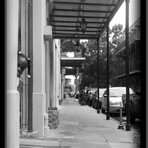
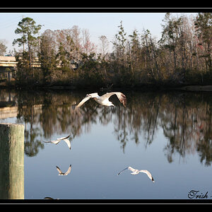
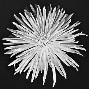
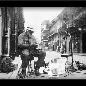
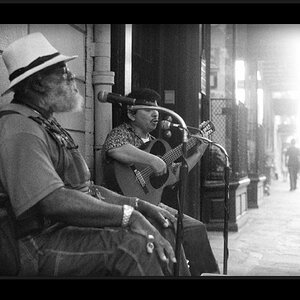
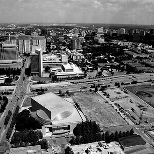
All of the above and more, if you visiting these places you get a sense of place and hopefully helpful travel and photag tips. What I really want is feedback......Thanks


![[No title]](/data/xfmg/thumbnail/37/37106-bbbc8e30f409f82c56bead43c7565d5a.jpg?1619737882)