woodsac
TPF Noob!
- Joined
- Jul 14, 2005
- Messages
- 5,712
- Reaction score
- 260
- Location
- In a black hole
- Website
- www.around395.com
- Can others edit my Photos
- Photos NOT OK to edit
And nobody rode you for it...just show we do like youjocose said:Egads! I just noticed that I spelled "entrance" wrong...oops :blushing:
")
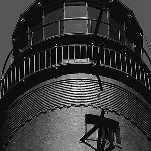
For me, it's the white portion of the frame. The shiny, plastic looking corners and dual colors (might be a shadow) just distract from the photo.