New England Moments
TPF Noob!
- Joined
- May 13, 2007
- Messages
- 453
- Reaction score
- 0
- Location
- Vermont
- Can others edit my Photos
- Photos NOT OK to edit
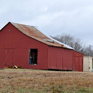
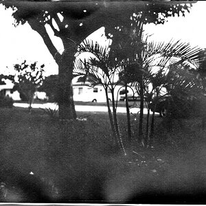
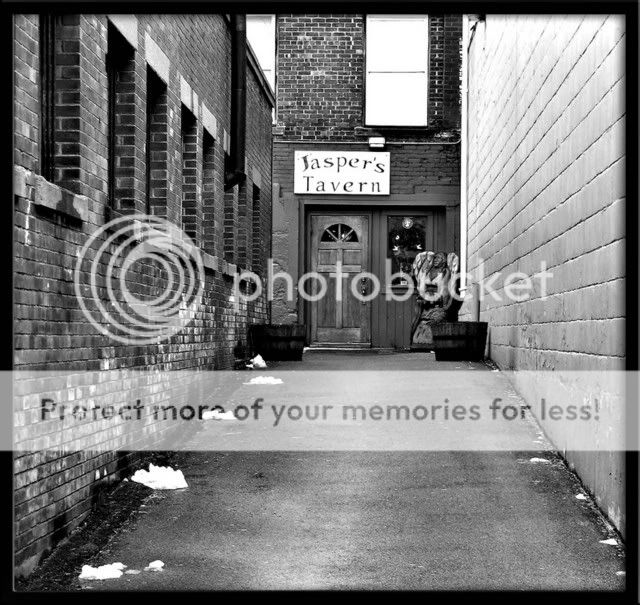
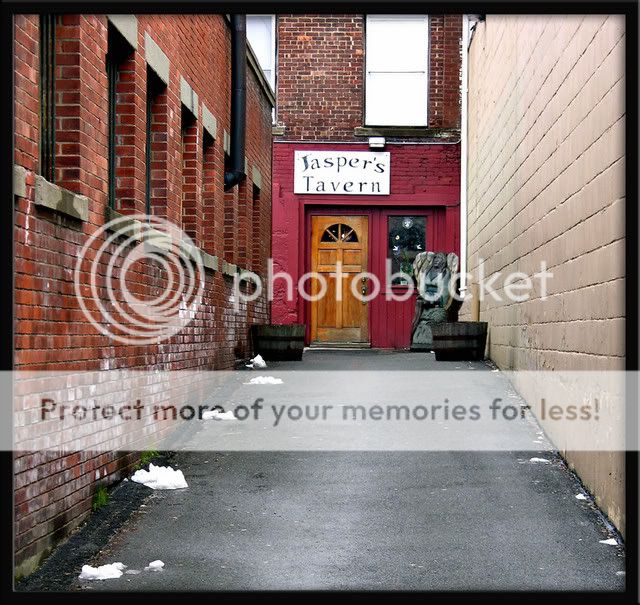
Ok here are two shots, most would say this is a B+W shot, but to show ANGLES/LINES/ and TEXTURE.... Don't you Feel the Color Conveys this better.. ???
Thoughts?? and as usual open season on any comment or critique??
Thoughts?? and as usual open season on any comment or critique??
")