HoboSyke
No longer a newbie, moving up!
- Joined
- Jun 8, 2005
- Messages
- 1,051
- Reaction score
- 7
- Location
- Sydney - Australia
- Website
- www.flickr.com
- Can others edit my Photos
- Photos OK to edit
Shot these on the weekend for a pal.. Comments and critque welcome as always.
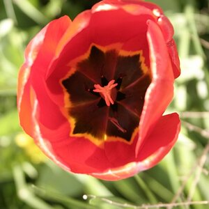
1.

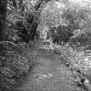
2.

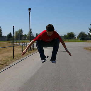
3.

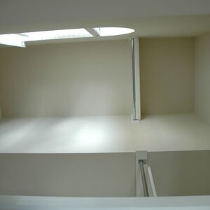
4.

5.

6.

7.

8.

9.

10.

11.

12.

13.

14.

1.
2.
3.
4.
5.
6.
7.
8.
9.
10.
11.
12.
13.
14.


 good job