Trever1t
Been spending a lot of time on here!
- Joined
- Dec 30, 2010
- Messages
- 9,331
- Reaction score
- 2,722
- Location
- San Jose, CA
- Website
- wsgphotography.com
- Can others edit my Photos
- Photos NOT OK to edit
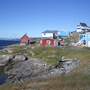
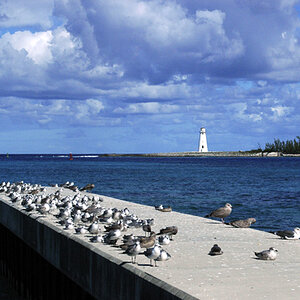
Premiering my new watermark and keeping inline with my minimalistic motif.

_POR2383-Edit by WSG Photography, on Flickr
_POR2383-Edit by WSG Photography, on Flickr

![[No title]](/data/xfmg/thumbnail/42/42465-64dd69400e2bfaf59e558c3d8c934271.jpg?1619740192)


![[No title]](/data/xfmg/thumbnail/37/37643-1ec2500989f6f4894b6e6323c2d3669e.jpg?1619738160)