C&C desired

It could do with a bit more DoF. The out of focus hands are somewhat distracting.
You obviously posed the hands, and posed them very well so why throw them out of focus with the near wide open lens.
 
I agree on the OOF hands. A couple of other minor nits are the bit of necklace peeking below her arm, and the umbrella's wrist strap. I'm actually not fond of the posing of the hands, it seems a trifle forced to me.
 
I'm not digging the posing of the hands as it feels forced. Her shoulders seem to be a bit too square to the camera and that throws off the whole pose for me.
 
Her eyes meet the lens in direct gaze, but the eyes are just a slight bit OOF...tip of the nose appears sharpest...but more so than the focus/DOF issue is the expression; her expression just doesn't seem quite "right"...it does not seem genuine, or relaxed....something, and it is difficult to say what, doesn't feel quite, well genuine, or to use the new popular word, it doesn't feel quite authentic. The shallow DOF band, with the foreground hands and arm OOF, and then the strongly patterned umbrella/parasol material OOF...I dunno...this photo is a close-in and intimate photo, it's almost like we are crammed into a very small space with her, due to the OOF foreground bokeh and extended hands showing us the distance involved, and then the immediate, enclosing background, the parasol...we are definitely "up close and personal", but there's not quite enough in-focus to latch onto...for me at least, psychologically. the shallow DOF works against the "enclosed space" that the props are creating. I think that's the thing,technically, that bugs me. And then the expression, it just doesn't seem quite relaxed enough...the eyes and the mouth expressions are not coordinating quite right. There seems like a bit of tension in her jaw or facial muscles. YMMV.
 
I like the concept.

I will also say that the hand posing looks really unnatural to me. Next time just tell her to hold the umbrella and see what she does normally, on her own. Eyes are also out of focus. Might wanna step up your f-stop just a bit. That would solve a lot of the issues here.

The watermark is also really distracting, but I suppose that's personal taste.

My question is why not post images you're not happy with? C&C is one of the best ways to get better.
 
I am thinking the umbrella is what I don't like. Doesn't fit for me but I can't explain why exactly. Smile, colors, etc. look good.
 
Normally I wouldn't post an image I'm not happy with but this one is bugging me.

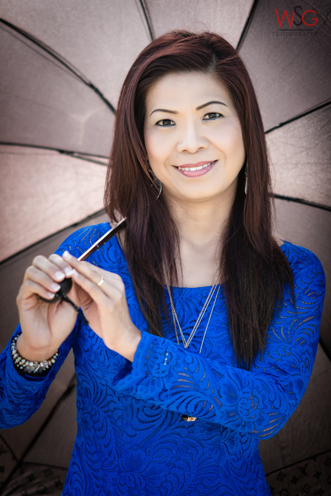
_POR1005-Edit by WSG Photography, on Flickr

I won't bias you with my thoughts, I'd like to hear yours.
The color rendition is what bothers me most. Her right hand, more than her left, looks unnaturally brownish, at least on my computer screen. Also, the skin tone on the face looks a little too cool. (It may be accurate, but I would prefer it just a bit warmer.)
 
I won't bias you with my thoughts, I'd like to hear yours.
The oof hands are the first thing I noticed, and not in a good way.
The colors; dress is fine, skin color seems off, and it was a poor choice of umbrella color. Either orange or black would work well here.
Pose/frame; her left hand is something of a distraction, and you've cropped her elbow.
 
The hands look unnatural, her elbow cropped and the necklace peering from below her arm. I like the concept though. Love her blue dress and of course a very nice model. I'm not a professional, but just giving my 2 cents.
 
right on all counts but what really bugs me is the colors. Her skin looks dead and it's not due to my lack of trying, that darned umbrella must be casting a weird hue.
 

Most reactions

New Topics

Back
Top