C&C please

blueofspirit

TPF Noob!
Joined
Feb 2, 2010
Messages
43
Reaction score
0
Location
Hong Kong
Can others edit my Photos
Photos OK to edit
New to DSLRs - Canon 450D

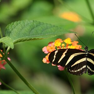
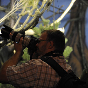
#1 - f/11; 1/200 ISO200

IMG_0346.jpg


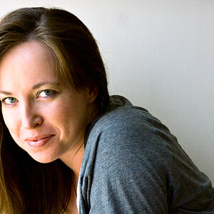
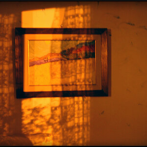
#2 - f/5.6 1/320 ISO200

IMG_0308-1.jpg


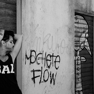
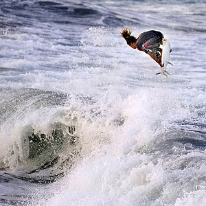
#3 - f5.6 1/13 ISO800

IMG_0236.jpg


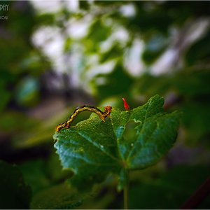
#4 - f4.5 1/40 ISO800
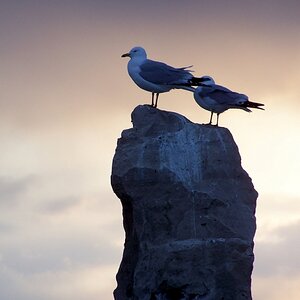


#5 - f5 1/80 ISO400

IMG_0193.jpg


Thanks!!
 
Last edited:
I like 1 and 4 the most. #2 is a little drab in comparison.

Also you can put the image up on here if you like... there is a sticky thread on how to do it somewhere.

Besides that, they look really good.
 
Thanks! Any suggestions how to improve the middle two?

Put the photos on pbucket now and added one more - the last one was in a really misty forest so wanted to capture the spooky feel to it. Don't think I have the right contrast though..comments welcome!
 
I like #4 and #5 a lot. Kind of bothers me that you minimized the person in the shot (assuming that is what I'm seeing at the bottom-center). Also agree with someone's earlier statement about #2, though reminds me of that wierd board game with the clay, the letter cubes and the green plastic frogs.... where some of the cards have cropped close-ups of something and you have to guess what it is.
IMG_0308-1a.jpg
 
I like 3/4/5. I think 5 would be better with the whole person or no person though.
 
Kind of bothers me that you minimized the person in the shot

Yea that's my girlfriend about 30 yards down the path. I wanted to avoid getting the actual path in the shot so cut her off. Would having the whole person be better even though small? Didn't want the person to dominate the photo.. or just no person at all?

reminds me of that wierd board game with the clay, the letter cubes and the green plastic frogs.... where some of the cards have cropped close-ups of something and you have to guess what it is.
IMG_0308-1a.jpg

LOL @ green plastic frogs. I know what you mean though. I felt the pattern of the veins looked quite geometrically pleasing. Any way I could have done this differently? Or are single leaf photos just not a good idea in general?
 
personally i only think no 4 is good, the others are just not to my taste. No 4 is a real winner though :)
 
#2 looks a bit washed out; the sunlight on the leaf seems too bright for some reason.

#4 is really cool.
 
No 4 is pretty good. It looks like a thought out photo and not just a snapshot. The other ones are either out of focus or have other fundamental flaws.
 
No 4 is pretty good. It looks like a thought out photo and not just a snapshot. The other ones are either out of focus or have other fundamental flaws.

Could you elaborate on the fundamental flaws? Want to know how I could improve on my technique..

#4 is the ceiling decor at some fancy French restaurant - basically copper tubes dangling from the ceiling with lighting in between.
 
I am no expert, barely even a beginner, but here is my 2cents....

1. The top right corner is way too bright.
2. The background is distractiong, maybe fill the shot with more leaves instead of half dirt and shadows.
3. Maybe a little more DOF...I also feel as if i'm being pushed out of the shot instead of being drawn into it.
4. Superb - Love it!!!
5. I would have added the entire person, or deleted the entire person....no half people. Like the foggy forest though. I might punch up the contrast a bit...

Like I said, I'm no expert, and I may be totally wrong with my opinions....Take from it what you will. ;)
 
I don't really care for 1-3. Maybe it's personal taste as all 3 are close up of leaves that aren't terribly unique. I think 2 would be better if the bottom part of the leave wasn't cut off. Number 4 is cool. Is one of those photo's that make you say WTF is that? Same thing everyone else said on 5. I think it is cool but all the person or none. You could PP them out. I think 1, 2, and maybe 5 could look better with very minor PP to fix blown out areas, contrast, saturation, etc...

BTW, I'm pretty much a total noob so take my advice for what it's worth.....NOTHING!;)
 
#2 interesting to see the shadow of the leaf in shot, perhaps a different composition existing exploring the relationship between these two....the whole of the leaf would need to be in focus though?
 
I like 5. Even with the half person. It conveys a very strong emotion, unlike the others. Technically, it may not be perfect- but whoopee, it has a soul.

p!nK
 

Most reactions

Back
Top