
OP
OP
Battou
TPF junkie!
- Joined
- May 10, 2007
- Messages
- 8,047
- Reaction score
- 66
- Location
- Slapamonkey, New York
- Website
- www.photo-lucidity.com
- Can others edit my Photos
- Photos NOT OK to edit
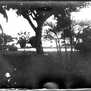
The last two attempts I have made in that effort I made the same friggen mistake drawing attention away from the intended focus, the first one was a contrasting black pen on a white surface in the background of a predominately amber setting and the most reasent was a set of white lines leading into a large white space to the right of a black subject.
A few things that spring to my mind include:
– Since different colors have differing wavelengths, cool colors seem to recede, while warm colors project.
– The eye is drawn to the brightest values in an image. When mixing bright and dark values in the same image, it's likely the eye will not find a place to settle. The image is said to be "busy."
– Diagonal and curved lines convey the feeling of motion.
– Converging lines, or the same form repeating in reducing or increasing sizes can help convey depth.
Like I say, these are just a few things that immediately come to mind.
I hope this helps.
-Pete
Afore mentioned last two attempts so you can see what I was referring to..
http://www.thephotoforum.com/forum/black-white-gallery/158174-home-brew.html
http://www.thephotoforum.com/forum/general-gallery/115562-no-exceptions.html - This one has other flaws that I have already learnd about eliminating...For what it's worth.
 Didn't like the method photography, eh?
![[No title]](/data/xfmg/thumbnail/40/40286-86401b94de8b01bea8bb4ea154aaea0a.jpg?1619739408)
![[No title]](/data/xfmg/thumbnail/41/41782-daa26990361bf4193a874908bda10dbb.jpg?1619739891)
![[No title]](/data/xfmg/thumbnail/42/42060-f597479f8fd78d4bb4d17e7686fb0812.jpg?1619739996)


![[No title]](/data/xfmg/thumbnail/40/40287-4f839095000f74d779b90ed75df9dc62.jpg?1619739408)
![[No title]](/data/xfmg/thumbnail/42/42059-61b97bbebb00e6276672551f4e3b3e43.jpg?1619739995)


![[No title]](/data/xfmg/thumbnail/30/30862-d177ccfc3a82369b1005863cfe5fd13d.jpg?1619734481)