Navigation
Install the app
How to install the app on iOS
Follow along with the video below to see how to install our site as a web app on your home screen.

Note: This feature currently requires accessing the site using the built-in Safari browser.
More options
You are using an out of date browser. It may not display this or other websites correctly.
You should upgrade or use an alternative browser.
You should upgrade or use an alternative browser.
Cool logo treatment or not so hot?
- Thread starter inTempus
- Start date
dustinpedley
TPF Noob!
- Joined
- Nov 23, 2008
- Messages
- 93
- Reaction score
- 1
- Location
- Missoula MT
- Can others edit my Photos
- Photos OK to edit
the first one is better, this text looks to pedestrian to me but i do like how its more transparent.
my $.02
my $.02
inTempus
TPF Noob!
- Joined
- Dec 15, 2008
- Messages
- 3,692
- Reaction score
- 4
- Location
- Indiana
- Can others edit my Photos
- Photos OK to edit
No, I wouldn't do it to every image.I like the logo for situations like this where your displaying images on forums and sites but not for my personal collection.
I definitely like #2 better
EleanorW
TPF Noob!
- Joined
- Aug 10, 2009
- Messages
- 271
- Reaction score
- 0
- Location
- Saskatoon, Saskatchewan
- Can others edit my Photos
- Photos OK to edit
Can you make the 1st more transparent like the 2nd one? That would be a good look I think.
c.cloudwalker
TPF Noob!
- Joined
- Jun 15, 2009
- Messages
- 5,394
- Reaction score
- 405
- Location
- An American in Europe
- Can others edit my Photos
- Photos NOT OK to edit
Does anyone know what a logo is?
inTempus
TPF Noob!
- Joined
- Dec 15, 2008
- Messages
- 3,692
- Reaction score
- 4
- Location
- Indiana
- Can others edit my Photos
- Photos OK to edit
Since I've worked in advertising for some 15 years... I'm pretty sure I have an idea what a logo is. What do you think it is? It doesn't always have to be an icon or graphic. Text is commonly used, if that's the brand image.Does anyone know what a logo is?
dustinpedley
TPF Noob!
- Joined
- Nov 23, 2008
- Messages
- 93
- Reaction score
- 1
- Location
- Missoula MT
- Can others edit my Photos
- Photos OK to edit
there we go thats a keeper
dustinpedley
TPF Noob!
- Joined
- Nov 23, 2008
- Messages
- 93
- Reaction score
- 1
- Location
- Missoula MT
- Can others edit my Photos
- Photos OK to edit
It's slutty, rinky-dink, low brow enough?there we go thats a keeper
At least were on the same page :cheers::cheers:
chammer
TPF Noob!
- Joined
- Jul 30, 2009
- Messages
- 640
- Reaction score
- 5
- Location
- Virginia Beach, VA
- Can others edit my Photos
- Photos OK to edit
sorry for the quick hijack, but i love that avatar dustin. iz rocks!
Derrel
Mr. Rain Cloud
- Joined
- Jul 23, 2009
- Messages
- 48,225
- Reaction score
- 18,941
- Location
- USA
- Website
- www.pbase.com
- Can others edit my Photos
- Photos OK to edit
I think the blocky, new-age font you're using on InTempus is very hard to read...it's simply not an "at-a-glance" font...I cannot read it intuitively, in a few milliseconds,and I think that is the goal for a "brand" font and a brand-level image.
As to the fellow who watermarks every image,but changes the font with each image--most branding experts would caution against that much variation from image to image.
In the shot of the model standing on the chair at the beach, the very large logo becomes an element in the photo's compositional space, and in my opinion, ruins the shot entirely; the logo competes very strongly for attention with the photo's content,and it diminishes your photographic efforts.
inTempus
TPF Noob!
- Joined
- Dec 15, 2008
- Messages
- 3,692
- Reaction score
- 4
- Location
- Indiana
- Can others edit my Photos
- Photos OK to edit
Derrel, you right about not changing your font all the time. That's a no-no. It works for him, but typically speaking that's not something you do.
I'm keeping my font, I like it as it fits how I view myself and images. I'm not going for the instant (within milliseconds) readability, I'm looking for something out of the ordinary and memorable.
Here's the final version I'm using for my avatar on MM:

As I mentioned, this isn't something I plan to do to each image. I will do it to one or so each shooting session so I may change my avatar occasionally.
As for the web watermark that I will use to prevent piracy, I will probably go with the URL at the bottom for now. The goal is to mark the image as mine and to discourage theft and also to tell people how to contact me should they want the image legitimately.
I'm keeping my font, I like it as it fits how I view myself and images. I'm not going for the instant (within milliseconds) readability, I'm looking for something out of the ordinary and memorable.
Here's the final version I'm using for my avatar on MM:

As I mentioned, this isn't something I plan to do to each image. I will do it to one or so each shooting session so I may change my avatar occasionally.
As for the web watermark that I will use to prevent piracy, I will probably go with the URL at the bottom for now. The goal is to mark the image as mine and to discourage theft and also to tell people how to contact me should they want the image legitimately.
Mturulski
TPF Noob!
- Joined
- Jul 7, 2009
- Messages
- 72
- Reaction score
- 0
- Location
- Magnolia, Delaware
- Can others edit my Photos
- Photos OK to edit
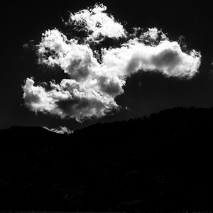
For what it's worth I like this one. I love how the opacity of the font makes the clouds look more ominous. I do think it is a bit distracting, and draws my attention away from a very cool shot, but from what i gather that's not one of your concerns in this case, so no biggie there.
Similar threads
- Replies
- 2
- Views
- 2K
- Replies
- 18
- Views
- 3K
- Replies
- 9
- Views
- 1K
- Replies
- 5
- Views
- 2K


![[No title]](/data/xfmg/thumbnail/31/31049-df2ef80e523fe4368eb8a82e03ad0b90.jpg?1619734587)


![[No title]](/data/xfmg/thumbnail/42/42397-30faa170de7ed9be38adf00b9b26a220.jpg?1619740167)


