Critiques, please!

Claudia_Neurojuice

TPF Noob!
Joined
Nov 22, 2014
Messages
11
Reaction score
1
Can others edit my Photos
Photos OK to edit
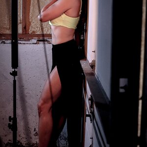
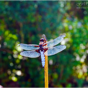
So, here's the first photo I would like to read your comments on. I'm particularly fond of this one, but it was one of my first attempts with a DSLR and I know it has many flaws. It was shot outdoors, at night, under artificial lighting and...with 1/6 s shutter speed, so it is not as sharp as it could have been.

I also know that the stuff on the right hand side of the photo should be cropped away or otherwise removed/hidden - what do you suggest? I'd love to hear your comments on this shot!

Thanks!

One. by Neurojuicephoto, on Flickr
 
Last edited:
There's really not much to do because you've foreclosed most of the options with the enormous light flare over his shoulder, the framing and the contrasty conversion to BW
Since much of his face is obscured by the glare, you can't really turn it into a close-cropped portrait (in portrait aspect ratio) yet the surroundings give no idea of context.
Typically I would have his eyes a bit higher in the frame but there isn't the room to do that.
The wall behind him and the stuff at the right are at an obvious slant but that's the only context that will justify including that space.

I would start from scratch and be a bit less aggressive with both the light flare and the contrasty conversion.

face2222.jpg
 
Hello The Traveler, thank you for taking the time to comment on this. As for the light flare, unfortunately it creates a very sharp white "cut" on the upper left side, otherwise I wouldn't mind it too much - I like the effect it creates with the smoke. I have tried to reduce the highlights but, to me, it sort of spoils the whole shot, as the part of his face that's hidden by the smoke turns opaque and looks very fake. Maybe I'm just not good enough with Ligthroom/PS, I acknowledge the flare is a bit annoying - perhaps I should have hidden it behind his head?


Please clarify this point: The wall behind him and the stuff at the right are at an obvious slant but that's the only context that will justify including that space.
(Sorry, as you may guess English is not my native language and sometimes I need to ask for clarifications!)

Thanks for your patience! :02.47-tranquillity:
 
For what it's worth I also believe the the flare is too bright. If you do hide it behind hi head watch out for a halo that might result into an image you may not like, distracting the viewer from other elements of the picture.
 
I have tried to reduce the highlights but, to me, it sort of spoils the whole shot, as the part of his face that's hidden by the smoke turns opaque and looks very fake.

You can only reduce highlights if there is some detail there. If the highlight is totally blown out (over-exposed) all you will do is make the white into grey.

This is unfortunately over-exposed and, in my opinion, not fixable. Just too much glare


Please clarify this point: The wall behind him and the stuff at the right are at an obvious slant but that's the only context that will justify including that space.
(Sorry, as you may guess English is not my native language and sometimes I need to ask for clarifications!)

If you frame a portrait so that there is lots of space in addition to the subject, anything in that space needs to have some role in the image. It may provide some information about the subject or just balance the content. What it shouldn't do is attract attention because it looks 'off' somehow. Slanted walls and shelves look off and draw attention to themselves - which is not what I would want.

Your English is fine, sometimes I take short cuts in explanations; I'm sorry for that.

Shoot more pictures.
 
Last edited:
Sorry for the delay and thanks to all of you again.
The Traveler, thans for clarifying. Yes, I'm afraid a slice of the flare is actually blown out...this one will remain among the imperfect shots I love but I'll try to do better next time! :)
 
All of us have imperfect shots that we love for any sort of different reasons.
Regardless of the worth of this picture in some absolute sense, what it does show is that you want to make pictures, to create and are not just aiming for a technically good but empty copy of a department store photo studio.
Good for you.
The technical skills and fineness of judgement will catch up eventually and you'll be fine.

Lew
 
A little work with PS to make it include what can't be eliminated just to see:
reduce flare a bit.jpg


.......................at the condo at New Smyrna so only have laptop and mouse to play with pic a little.
denny
 

Most reactions

New Topics

Back
Top