
darin3200
TPF Noob!
- Joined
- May 3, 2005
- Messages
- 2,078
- Reaction score
- 28
- Location
- Des Moines, Iowa
- Website
- friedrichsphotography.com
Intent: To show how the large amount of dandelions in a field in a more artistic way. To also show how even though many have been 'destroyed' many more remain to take their place. I like the depth of field but I'm not sure about the blurring near the bottom, but cropping it out seems to make the picture more shallow and hurts the intent.
Equip: Praktica MTL-3, Lense: Pentacon 50mm f/1.8, Kodak C-41 B&W, Shutter speed: 500, f/2.8
OTE (okay-to-edit)")

Equip: Praktica MTL-3, Lense: Pentacon 50mm f/1.8, Kodak C-41 B&W, Shutter speed: 500, f/2.8
OTE (okay-to-edit)


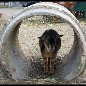


![[No title]](/data/xfmg/thumbnail/37/37518-fb05b52482bd05e84fb73316ba1a9c8f.jpg?1619738128)
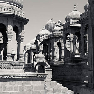
![[No title]](/data/xfmg/thumbnail/32/32929-22e23acc63d6ecb25e5ee941be87121f.jpg?1619735758)
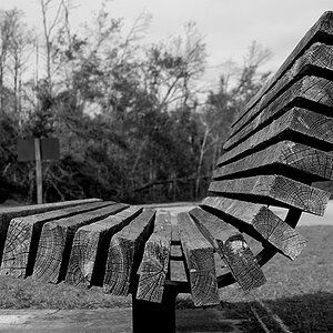
![[No title]](/data/xfmg/thumbnail/33/33422-d1097b04586502aba932c8d5409d8026.jpg?1619735961)