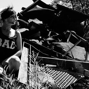
I did not mean to delete the image with the horrible border...but I did. I have been playing with all manner of borders to enhance my photos...the first one was a failure and thanks to all who viewed and reviewed. Do you like this one better?
Edit: Also, I'm thinking all the saving of jpgs have caused a deterioration of the photo...I'm not liking the quality of it as well anymore.
Thank you all very much for looking and taking the time to critique. The border problems I have will probably continue until I settle on something I think will work for most postings. I've looked at a lot of photos on this and other forums and almost without fail I like the look of a border/frame rather than without. In the brick & mortar world it would be matted so I'm trying to duplicate that feel.
Thanks again for your (here in La. it's "all y'alls") help. If anyone else would like to weigh in, I would appreciate that cc too.
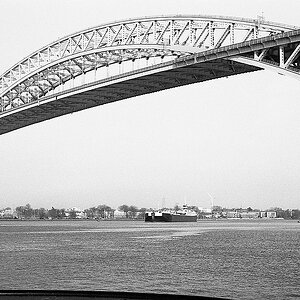
I know. Actually, it's not all perspective. The dipping corner coupled with the sagging building make for an old world look. However, I do think there is some perspective distortion, as you say. I can't imagine why, though. I lined this shot up square to the building.
I know. Actually, it's not all perspective. The dipping corner coupled with the sagging building make for an old world look. However, I do think there is some perspective distortion, as you say. I can't imagine why, though. I lined this shot up square to the building.
I guess I missed the first border. Unless it's one that daft or gaudy, I could care less, but I understand you wanting to emulate a finished print.
The distortion is apparent, but given the location it seems appropiate. This is a very nice photo. I love the colors, textures and that sky is something else. Really helps to set the mood.
I think the bottle crates by the door look neat. I may had tried to see if it were possible to (temporarily) remove the rubbish bins for the shot.
The distortion is apparent, but given the location it seems appropiate. This is a very nice photo. I love the colors, textures and that sky is something else. Really helps to set the mood.
Saturated the sign over the door...in the print you can see clearly that it says: "Quarter Master", the name of the store. Also saturated the milk crates, the awning and the stop sign.


![[No title]](/data/xfmg/thumbnail/36/36662-242aa39f5cb3a23494857864779f669b.jpg?1619737675)
![[No title]](/data/xfmg/thumbnail/42/42025-fa343f816d0cedc45447aa0b300e301e.jpg?1619739982)