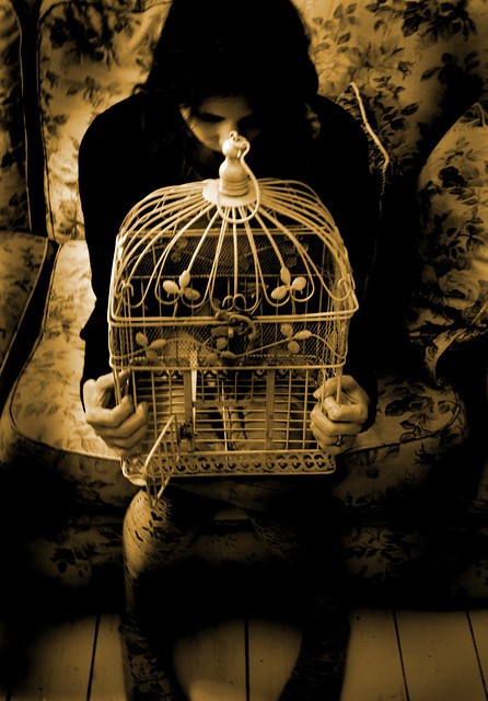
I'm not very good at editing - my tools are very basic. However, if you look at where the bright and dark tones are, the bright tones are at the perimeter, the cage is mid-tone and separated from the bright tones by the dark areas (Girl, furniture). So in terms of flow, there isn't much. If the cage was slightly brighter (giving the visual clue that that's were we need to look), and the bright areas at the perimeter were toned down, then there would be a clearer place for the eye to go. As it is, our eyes normally to to the eyes in the image, then the brighter/sharper portions of the image, and work our way around the image using lines, shapes, contours and gradations of brightness. So even with a conceptual image, the trick is to get the eye to land on the right starting point in the image, and then provide visual clues (lines, gradations, sharpness) to allow the eye to explore the image in a "guided" manner, and in the process recognize more and more as the eye explores. At a certain point, this accumulation of bits coalesces into meaning, and may result in an "aha!" reaction.
")

 I might have another go at that
")


![[No title]](/data/xfmg/thumbnail/37/37121-fda7b1957cb0d0be7bab1ddd3ec87847.jpg?1734169832)


![[No title]](/data/xfmg/thumbnail/37/37170-3e18af574ed51cce5bdf99af9d3cab40.jpg?1734169892)

