First Attempt at Headshots

ABJayce

TPF Noob!
Joined
Feb 14, 2013
Messages
51
Reaction score
10
Location
Washington, DC
Website
www.artsbyjaycephotography.com
Can others edit my Photos
Photos OK to edit
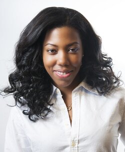
I had this aspiring actress contact me wanting some headshot photos. Any feedback you could give would be great. I just resized the images to throw up on here and it took some of the color out of her skin. The issues I have is I think I should have lit up the backdrop more and on the first image my I think my hair light is lighting that back patch of hair a little too much because it is more brown than the rest of the hair. $DSC_2738.jpg$DSC_2754.jpg
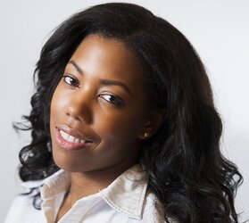
 
Not too bad for a start. They both have a hot spot on her forehead. On the first one, I would raise the light a little more, but this is a personal opinion.
 
She looks very different in both these shots. The squareish composition in #1 looks blocky, kind of dumpy, static, dull; we need to see more base, more chest, with the head feeling higher-up in the frame. A square feels plodding. In the second shot, her cute cheek bone structure is really revealed nicely, but at the same time, she feels "closed-off", retiring, shy, and a bit slump shouldered--which contradicts the big smile. She needs a more upright, erect, perky body posture.

Lighting-wise I agree...the backdrop is a bit gray. The lighting on her is okay. Not great, not excellent, but not horrible either. I dunno...I'm not 100% SOLD on these two shots for something as important as a headshot. I mean the pose/smile disconnect in #2 is a big deal...she is "acting" shy, but "projecting" a smile...the posing and the emotional projection MUST synchronize for an actor.

One is lit with a short lighting scheme, the other broad lighted, which I think ought to be unified within the same clothes change. Go one way or the other with each change of clothes. She also has no eye-sparkle in the second shot, which I think hurts the shot.

Thank you both for your input and I do have a shoot with her again soon and I will write this down and put it into practice. I totally agree with you about the posing and about being shy. She is a very shy girl and I talked with her, made her laugh a lot, put on some music which all relaxed her but she said she was feeling self-conscious about what she was wearing and wanted to dress up a bit more, this was before the shoot even started. I worked with her and got her to relax and told her to bring a few outfits for the next shoot and she seems very excited and eager to do it so we will see how it goes. I'll include another image I took with more of the chest as well to see what I can fix in that also.
$DSC_2729.jpg
In this image, the hotspot on the head is still there, shirt is a bit wrinkled but that is all she had with her she came after she got out of school. I should have maybe angled her shoulders here to make it look not as flat. I'm not satisfied with the lighting on her face. It doesn't look even to me and no twinkle in the eye as was said earlier. The backdrop on the right is lit better but the left looks a shade darker/more gray. She looks more confident and relaxed in this shot, this was taken after I talked with her more, made her laugh and put on some music. She didn't look comfortable in the other shots and I didn't want to make her feel even more uncomfortable by telling her that so I told her I needed to change my memory card, which I didn't, but I took that time to just sit and chat with her and you can tell a difference. I should have moved my main light to the right more, it would have put the sparkle from the flash in the middle of the eyes instead of far left of it.

I still just need a bit more work on headshots and being more aware of not just focusing on the model but taking note of other elements.
 
When I upload the image on to the site it looks more dull. Looking at the image on my desktop side by side with the uploaded one, my desktop version has more color in her face and eyes
 
I agree, these are very good head shots. I would smooth the lighting on the forehead and face. There is too much shadowing on her face in the first picture. With the second picture, her eyes and teeth should really shine; her lips also look dull and dry. On some of the pictures make sure to photoshop the wrinkles in her clothing. Overall, for the first time, impressive head shots. good luck in the future!
 

Most reactions

New Topics

Back
Top