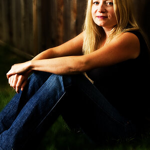
I dont really like her pose in #1 or #2, they look a bit unnatural and forced. I guess I dont like the wall either, it's a bit distracting from the model. The flare on #3 is distracting. Maybe its me, but the focus doesn't seem to be spot on in #4.
Once again everyone thanx for the comments and I will take all this and apply it next time. Its all the little things that you all pointed out that I am still learning to find in my shot's.....
1 and 4 are awesome shots.
the background in #2 is too distacting for me.
and the 3rd lacks something...altho she looks amazing theres something lackluster about the colors or contrast.
nice work.


![[No title]](/data/xfmg/thumbnail/31/31979-ea92aca54ae865842d998c9cec534991.jpg?1619735137)