From portraits to jewerly? trying something different

IgsEMT

No longer a newbie, moving up!
Joined
Jul 27, 2009
Messages
2,694
Reaction score
50
Location
NYC
Website
www.pictureperfectny.com
Can others edit my Photos
Photos NOT OK to edit
Hi All,
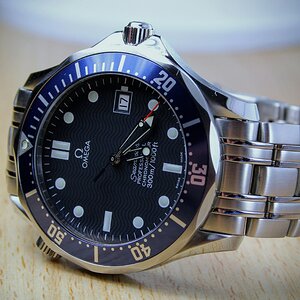
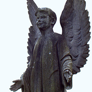
Just wondering if I can get feedback on few of these. My background is more of wedding/portraits/event photography but recently I was approach to shoot some stuff for a jeweler. Product photography is a bit different then what I normally do thus prior to take on the assignment, I thought to get a little practice.

Camera: Nikon d90 mounted with Nikon 28-105 3.5-4.5 D IF AF (macro 50-105)
Exposure: ISO 200, 1/200sec, f/8,
WB: costume WB via gray card,
Metering: Centered (Kind of irrelevant since I shoot mostly manual anyways)
Processing: Capture NX2 with Nik's Color Efex
Lighting: NIKON SB800 and SB600 at manual settings 1/128power about a 12in from subjects on both sides (90degrees with respect to camera). SB800 mounted with omnibounce, SB600 mounted with DIY bounce card (front foil)
The actual assignment will be shot using D300 (borrow from studio)


1
(white paper as background)
2009122124_009-vi.jpg


2 gray card as background
2009122124_014-vi.jpg


3
gray card as background
2009122124_015-vi.jpg


Thanks
 
Last edited:
To me, in #2 the shine off of the jewelery helps it jump out where you used the gray card as a background. I think I like #2 the best. Did the jeweler decide the positioning for the rings? #3 is a little difficult to differentiate the 3 different rings and the shadow created by the diamond looks too harsh.

Edit: I just saw that this was practice for the real shoot. Keep in mind that you will probably need to shoot in color so that you get an actual representation of what the jewelry will look like. I think you did a better job of capturing the color in #1 than you did in #3.
 
Last edited:
I'd PP these a lot and give it a darker background to make the jewelry pop. Also, I think they're a little slanted, an easy fix though. Shooting jewelry is fun, ring shots are some of my favorites from weddings.
 
I think they look good if they are they were a part of someone's wedding album. But for a stand alone product shot they are not there yet. I think there should be greater control over the direct and specular reflections in order to control the tone and highlights, respectively (white cards and black cards). For rings with large stones, there are techniques to get light into them. I really don't think you want to stack the rings inside one another. The gray backgrounds are not really fitting. Most nice shots of rings have the rings standing on their sides. For a professional point of view and probably what your client would want, it needs to be pushed a lot farther. There are written and video tutorials online that could give you some ideas.
 
Looks like you are getting some dark areas in the gold. You need more reflectors so that doesn't happen. Make sure everything is clean as well, both product and background. Definitely go with a darker background for jewelry photography. Good Luck!
 
thanks for your comments...
just want to give feedback/discuss based on each reply.

To me, in #2 the shine off of the jewelery helps it jump out where you used the gray card as a background. I think I like #2 the best. Did the jeweler decide the positioning for the rings? #3 is a little difficult to differentiate the 3 different rings and the shadow created by the diamond looks too harsh.

Edit: I just saw that this was practice for the real shoot. Keep in mind that you will probably need to shoot in color so that you get an actual representation of what the jewelry will look like. I think you did a better job of capturing the color in #1 than you did in #3.

I edit them most to monochrome, personal flavor. I agree about the colors - #1 I kept in color but it was actually ambient light color. The real light during the shoot will be color of the speedlites. I doubt, from conversation, that he'll want want me to shoot with ambient light as the main light sources.


I'd PP these a lot and give it a darker background to make the jewelry pop. Also, I think they're a little slanted, an easy fix though. Shooting jewelry is fun, ring shots are some of my favorites from weddings.
Darker as in grayER? I mainly used one filter from color efex, just adjust intensity of it here and there. Number of years ago, I need to shoot something very small and did that on black posing cloth 30-45degrees into the subject w/ respect to horizon. I hated the lighting - I lost too much of it. This time around, I tried with white paper and then for kicks with gray card under it.
For weddings, I do basic (ring on flowers, or tied with a strings, or BG holding them) though I think, I'll start doing something like this for the album.
Slanted - all of them were shot with camera in landscape 30-45 degrees into the item. Later on during rotation I made them the way they were.


I think they look good if they are they were a part of someone's wedding album. But for a stand alone product shot they are not there yet. I think there should be greater control over the direct and specular reflections in order to control the tone and highlights, respectively (white cards and black cards). For rings with large stones, there are techniques to get light into them. I really don't think you want to stack the rings inside one another. The gray backgrounds are not really fitting. Most nice shots of rings have the rings standing on their sides. For a professional point of view and probably what your client would want, it needs to be pushed a lot farther. There are written and video tutorials online that could give you some ideas.
Yeah, that stacking was amongst the last ones I shot and it was really an experiment what it would look like. Normally if I don't like something, I don't even show it off but PURE jewelry is a bit new for me, they just don't like to listen :). This 3 pieces are my wife's and mine and we don't have boxes or stands, so I just had to go with what was available. I see your point about stand alone items, my only fear and I hope it won't be the case that w/e holding devices he'll have won't be of various colors, just white - I'd really prefer NOT to spend hours removing color casts from diamond reflections.


Looks like you are getting some dark areas in the gold. You need more reflectors so that doesn't happen. Make sure everything is clean as well, both product and background. Definitely go with a darker background for jewelry photography. Good Luck!
Are you referring to #2? Its the wedding/portrait guy in me that uses shadows to enhance the subject but again, not sure how it flatters the jewelry :)


Folks, I appreciate the time you took to give me CC on there, perhaps try with few umbrellas and different background. It is definitely different then shooting people but is a nice challenge that I enjoy undertaking.
Thanks again
 
Yes, I am refering to #2. You can't let the wedding and portrait guy be around when shooting product. Dark areas in jewelry make the jewelry look cheap or worn. You need lots and lots of reflectors. A light tent is the best thing to shoot reflective objects in. Good luck!
 
Not sure if it has been mentionned, but often times, getting that sparkle in the diamond or such is a key thing in jewelry photos. This can be achieved with an additional light, usually from an LED flash light, right in front and shining on the diamond.

If its a straight up representation of the product, then often times having shallow DOF is a no-no as part of the item is blurry.

Look at adding in accessories as well, with nice contrasting colours, to add to the shot, but be careful not to have your accessory take over the shot.

White or black pPlexiglass can often work as a bottom as it has a nice reflection quality to it.
 
wow
thanks all 4 the input will try suggestions mentioned.
 

Most reactions

New Topics

Back
Top