Fun family

LCLimages

No longer a newbie, moving up!
Joined
Mar 27, 2014
Messages
354
Reaction score
311
Location
Missouri
Can others edit my Photos
Photos OK to edit
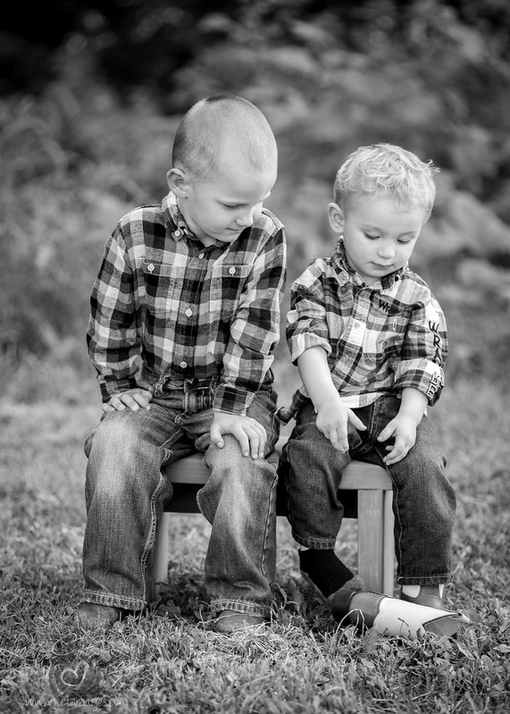
Oh my gosh, I loved this. The littlest boy wasn't having it, at all, and I have some great "outtakes" as a result. I have way too many from this session!

1.

2. Hey little dude, you gonna smile or what?


3. Ok, ditch your boots if you want...


4.

5.

6.

7.

8.

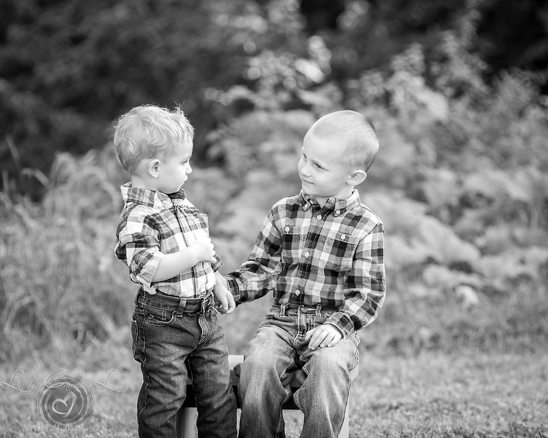
9. Brotherly love (?)


10.

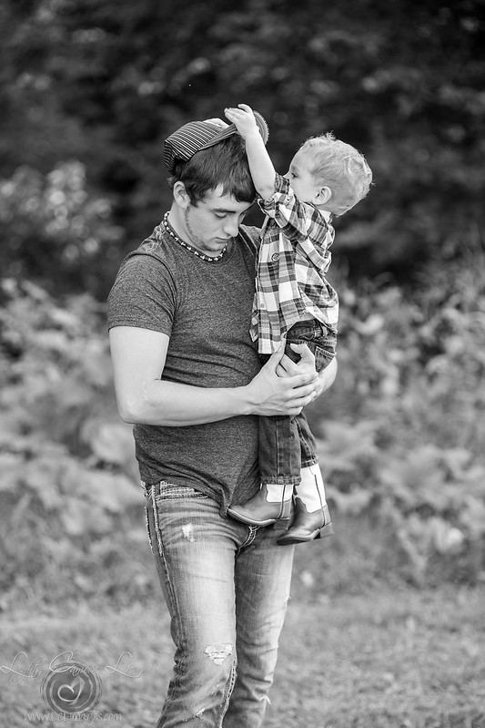
11. Ok Daddy you can have your hat back


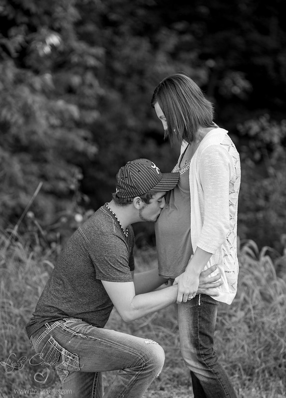
The mom said she hadn't even thought about doing any kind of maternity pics so I took a couple related to her belly. Hoping to have a Christmas baby girl back in the studio in a couple months!

12.

13.

We hoped a change of venue would help the younger boy perk up so we went inside once he started crying and the mosquitos started biting bad

14.

15.
 
These are lovely! Sometimes the pouty kid photos are my favs. lol
 
Thanks! Mine too but I know the happy kid photos are the sellers lol
 
Nice pictures but the framing is a bit loose and the processing a bit high-key for my tastes.
That loose framing means that a lot of the dramatic tension sort of leaks away.

And much of the color and texture is blown out of the boy's face.

Untitled-1boydiptych.jpg
 
Thanks Lew, I like your edit although to me it looks underexposed - I think some of that is just personal taste. Framing - I haven't messed with the crops too much, left some room to breathe on purpose for cropping for prints but I do agree they could be tightened up!

When I first started out years ago I had a tendency to underexpose and frame too tight. Learned the hard way I couldn't print, say, an 8x10 or 11x14 without cutting off toes or heads or having to clone the background in which isn't always practical. I think now it's easy for me to overcorrect that and run hot and loose. Ha ha, hot and loose. That sounds kind of dirty...

Back on topic, and... go!
 
FWIW, I always get told to crop in tighter too... I think the negative space is just a personal preference thing a lot of the time and I also, like you, leave room for cropping for prints especially because I do digital files. I'd rather leave all that wiggle room so when they print themselves they aren't like "where'd my head go?" ;)
 
If you post here for critique, it seems worthwhile to crop to the best framing you like for the display.
Leaving excess space means that people will spend time telling you about it for no reason.
 
If you post here for critique, it seems worthwhile to crop to the best framing you like for the display.
Leaving excess space means that people will spend time telling you about it for no reason.

Fair enough! I'll have to stop being lazy and posting the easy way, I guess. lol

Might get some of the same input though, but that's okay. I'm okay with negative space a lot of the time. Maybe the critiques will at least lean in a different direction if I take the extra minute of my life to crop down for critiques.
 
The "loose framing" Lew is talking about is due to the 3:2 aspect ratio your captures come out of the camera with. The big issue with small people is that 3:2 means they are very small in the frame on talls like this...cropping to the 5:4 AKA "8x10" or "4x5" aspect ratio, or even 4:3 aspect ratio makes the peopole become the focus of the shots, more so than the tall and skinny 3:2 ratio.

This is such a well-known issue that the pro Nikon bodies have a 5:4 aspect ratio option, for people who want a more-refined, more "impactful" aspect ratio for portraiture and headshots, in the traditional "eight by ten" aspect ratio. Again, 3:2 is a weird aspect ratio that was arrived at more or less arbitrarily, many decades ago. The problem is that on horizontals, the frame is, as many know, "Not tall enough,", and on verticals, the 3:2 frame ratio is "too skinny!"
 
FWIW, I always get told to crop in tighter too... I think the negative space is just a personal preference thing a lot of the time and I also, like you, leave room for cropping for prints especially because I do digital files. I'd rather leave all that wiggle room so when they print themselves they aren't like "where'd my head go?" ;)

Yes this lol - I do digital files too and your average client probably doesn't understand print ratios. I'm not a huge fan of excessive negative space really - I didn't intentionally leave a lot of it and I'm not one to go out and try to use it creatively, which I've seen a growing trend of lately. I guess I just didn't crop these down as much as I could have. Easy fix.
 
The growing trend of negative space is largely a result of many self-taught shooters who have not studied art, fine art, composition, or design. The study of composition is centuries old. There actually ARE many,many well-understood principles of composition, but the vast majority of people have not studied them at all. There is a difference too between negative space, and DEAD space, but the majority of self-taught shooters typically have no idea that what they are doing is leaving dead, empty space.

This never goes over well; people accuse me of being elitist when I use phrases like self-taught shooter, and so on, but it's what we have millions of now, world-wide. Photography is both an art, and a craft, and the vast majority of YouTube and web instruction is almost ENTIRELY craft-centric. How to focus, how to meter, how to position lights, but VERY little about how to best use the entire compositional space, or even anything about the theories underlying composition. THe issue is that the skills and theories needed for good composition are NOT from the field of photographic craft, but from the fine arts traditions, and from the study of design. Studying life drawing, still-life drawing, or painting, or sculpture, or any of the wother fine arts, and one is exposed to the theories of balance, proportion, design, composition.

Do you know how I can tell a really good photographer from a pretty good one? By how well he or she utilizes the frame, over about 25 shots. I can tell the reallllly skilled, high-level shooters from the self-taught, unstudied types that way, basically every single time. It's a good thing you are not following the "trend" toward a lot of dead space, because it marks you as an untrained wanna-be artist. The biggest way to tell a self-taught, poor composing shooter is to look at about 50 of his or her horizontal images, and see if they "pull everything low", and leave an extra amount of top-space on images they show. If they do, it is blatantly obvious that they have little skill in composition, even though they might be VERY good camera-handlers and exposure-setters. And of course, their verticals will also typically have very serious issues with too much, or wayyyy too little top space, and inelegant, distressingly awkward compositions, frame after frame.
 
Do you know how I can tell a really good photographer from a pretty good one? By how well he or she utilizes the frame, over about 25 shots. I can tell the reallllly skilled, high-level shooters from the self-taught, unstudied types that way, basically every single time. It's a good thing you are not following the "trend" toward a lot of dead space, because it marks you as an untrained wanna-be artist. The biggest way to tell a self-taught, poor composing shooter is to look at about 50 of his or her horizontal images, and see if they "pull everything low", and leave an extra amount of top-space on images they show. If they do, it is blatantly obvious that they have little skill in composition, even though they might be VERY good camera-handlers and exposure-setters. And of course, their verticals will also typically have very serious issues with too much, or wayyyy too little top space, and inelegant, distressingly awkward compositions, frame after frame.

I think you just described me. LOL. No hard feelings, Derrel.
 
I took a few minutes to re-crop and ever-so-slightly alter the images. The goal was to make the backgrounds less prominent, so I cropped out a lot of backgrounds. I re-touched out yellow blobs, and many grasses and leaves that were in competing or distracting positions, using Lightroom's clone tool. I altered the framing via cropping to get better line of sight harmony, to the extent that was possible. I burned in a lot of edges. You might not be able to see the revisions unless you look side-by side at the originals and the revisions, although some are pretty obviously different.

LCL_04_c_reworked.JPG
LCL_03_c_reworked.JPG


LCL_02_c_reworked.JPG


LCL_06_c_reworked.JPG
LCL_01_c_reworked.JPG


LCL_05_c_reworked.JPG


LCL_03_c_reworked.JPG
LCL_04_c_reworked.JPG


LCL_02_c_reworked.JPG


LCL_06_c_reworked.JPG
LCL_01_c_reworked.JPG


LCL_05_c_reworked.JPG


LCL_07_c_reworked.JPG
LCL_08_c_reworked.JPG


LCL_09_c_reworked.JPG


LCL_10_c_reworked.JPG
LCL_11_c_reworked.JPG


LCL_13_c_reworked.JPG


LCL_12_c_reworked.JPG
LCL_15_c_reworked.JPG


LCL_14_c_reworked.JPG


LCL_08_c_reworked.JPG
LCL_07_c_reworked.JPG


LCL_09_c_reworked.JPG
 
Holy cow Derrel. That's a lot of work lol. I get it - I'll frame them tighter. Something I most likely would have done in the end anyways. Lesson learned! ;-)
 

Most reactions

New Topics

Back
Top