I need some honest opinions please

Never seen work of Dennis Maitland until now. Very interesting. However I don't know if you can use his style for your assignment, he very often creates compositions and it looks, like he is using complex light set-ups and actors. For now I don't understand his conjunction of depletion and characters from "Alice in Wonderland". In short, I think you should not worry so much about composition, but more about the message. If it is 5 pics, then there is a story to tell and that must be clear. I would start with pic of the street sign, first seems to be good, then three interior pics and the last should be some sort of a conclusion, like in any reportage.
 
alright, abandonment/dilapidation is something to sort of work with to start. It's more of a theme than a subject, but it's somewhere to go from.

First, get closer. dilipidation is bet shown with sharp details. Your first shot has some empty space that is sort of 'clean' on the left wall. Get lower. The stains on the ground look promising to give a dirty foreground feel. Use a wide angle (if you have one), perspective distortion is good for a feel like that. Then, find key elements in the graffiti that draw your interest and think about balancing them in your image. YOu don't want too much going on in one corner of your image and nothing in another part. Think about what interests you in that frame, and how it makes your eyes travel across the viewfinder. That's how you want to 'direct traffic' with your composition. Finally, watch for any elements that slip into your frame that undermine your vision, ie distracting elements, and then frame your shot so they're not in it.
 
You've had some really good comments and suggestions. I'll just throw a couple of things on the heap. One is that the most common problem with the images of inexperienced photographers is that they are not close enough. Although it's kind of hard for me to see the contact sheets, a lot of the shots are from pretty far away, with some "tunnel" shots of hallways and stairs in which there is a lot of foreground and just receding lines in the background. Find details that tell the story and get closer. You could also try combining in the same frame something destroyed and something surprisingly intact (if there is anything like that). The idea someone posted about an intro shot establishing where you are, followed by detail shots, is a good one.
 
Never seen work of Dennis Maitland until now. Very interesting. However I don't know if you can use his style for your assignment, he very often creates compositions and it looks, like he is using complex light set-ups and actors. For now I don't understand his conjunction of depletion and characters from "Alice in Wonderland". In short, I think you should not worry so much about composition, but more about the message. If it is 5 pics, then there is a story to tell and that must be clear. I would start with pic of the street sign, first seems to be good, then three interior pics and the last should be some sort of a conclusion, like in any reportage.

Oh I'm not trying to use his style, I just like it. The rabbits have to do with the Chinese zodiac - Year of the Rabbit. From January 30th 11' to February 6 12' was the year of the Metal Hare. Next year of the Rabbit is like 2023 or somewhere around there; but where they fit in with the decay, I have no idea. I'm guessing he took the shots during that time frame of the Zodiac. Okay Timor, so your saying the Lake Shore Inn. sign is a good starting point? Also the graffiti picture is good? This is good. It's giving me ideas for Salton Sea on Friday.
 
alright, abandonment/dilapidation is something to sort of work with to start. It's more of a theme than a subject, but it's somewhere to go from.

First, get closer. dilipidation is bet shown with sharp details. Your first shot has some empty space that is sort of 'clean' on the left wall. Get lower. The stains on the ground look promising to give a dirty foreground feel. Use a wide angle (if you have one), perspective distortion is good for a feel like that. Then, find key elements in the graffiti that draw your interest and think about balancing them in your image. YOu don't want too much going on in one corner of your image and nothing in another part. Think about what interests you in that frame, and how it makes your eyes travel across the viewfinder. That's how you want to 'direct traffic' with your composition. Finally, watch for any elements that slip into your frame that undermine your vision, ie distracting elements, and then frame your shot so they're not in it.

Well I've been shooting with a Cannon Elan7 with a 28mm-105mm zoom lens, but I'm thinking of renting a Cannon AE-1. I can rent it with the standard 50mm lens and one additional lens with it. What do you think? I was also experimenting with yellow #8, red #25, and polarizer filters on the Elan7, should I rent them as well?

Interesting. So when you say you don't want much going on in one end, and nothing on another, I guess you can say that about the floor right? It's just the concrete floor. Then you have the broken wall and graffiti surrounding the plain floor. So for example, the graffiti they stood out to me was the anarchy symbol. How do I balance that in the picture with all the destruction right below it? Doesn't all that destruction distract?
 
You've had some really good comments and suggestions. I'll just throw a couple of things on the heap. One is that the most common problem with the images of inexperienced photographers is that they are not close enough. Although it's kind of hard for me to see the contact sheets, a lot of the shots are from pretty far away, with some "tunnel" shots of hallways and stairs in which there is a lot of foreground and just receding lines in the background. Find details that tell the story and get closer. You could also try combining in the same frame something destroyed and something surprisingly intact (if there is anything like that). The idea someone posted about an intro shot establishing where you are, followed by detail shots, is a good one.

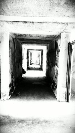
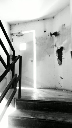
Hey KenC Thanks for the information. So like what Fjrabon said about the graffiti picture, get closer and lower? See I was thinking the hallway could be a use of line and form, but it's really not? Just receding lines to nowhere? Although, I can't even use the shots anyways, they are too dark, but just for learning purposes. $IMAG0793-1-1.jpg$IMAG0794-1.jpgWhat do you guys think of these pictures? These were taken with my camera phone, but I took the same shots with the 35mm. Well almost. Would these be considered good shots? Or not really? In the second picture on the 35mm, I got low and right next to the hand rail on the right side, and used it to "guide' up to the door. See, I've been taking this photo class for the semester, and yet I still don't really have a grasp on composition. I already told my instructor I come from a non-art background, but I'm willing to learn. I don't know if he just brushed me off, or whatever. In my projects, he never mentions what I can do to be a better photographer. I mean the info I've already received from you guys has made me see differently then anything I learned this whole semester! That's pretty sad on his part.
 
Sign will describe what this is about. Don't rent AE-1 unless you will get some ultra wide with it, otherwise Elan7 should do just fine. (It is Canon, not Cannon ;))
 
Sign will describe what this is about. Don't rent AE-1 unless you will get some ultra wide with it, otherwise Elan7 should do just fine. (It is Canon, not Cannon ;))

Okay. Have you ever used color filters before? I've been messing around with yellow 8, and red 25's, just wondering if I should continue using them, or just go with the UV or polarizer. Canon. Got it. haha
 
Okay. Have you ever used color filters before?
Always when shooting landscape or just outdoor. Indoor they make sens if you have to separate colors, which otherwise would present the same value on the print.
 
Hey KenC Thanks for the information. So like what Fjrabon said about the graffiti picture, get closer and lower? See I was thinking the hallway could be a use of line and form, but it's really not? Just receding lines to nowhere? Although, I can't even use the shots anyways, they are too dark, but just for learning purposes. View attachment 26943View attachment 26944What do you guys think of these pictures? These were taken with my camera phone, but I took the same shots with the 35mm. Well almost. Would these be considered good shots? Or not really? In the second picture on the 35mm, I got low and right next to the hand rail on the right side, and used it to "guide' up to the door. See, I've been taking this photo class for the semester, and yet I still don't really have a grasp on composition. I already told my instructor I come from a non-art background, but I'm willing to learn. I don't know if he just brushed me off, or whatever. In my projects, he never mentions what I can do to be a better photographer. I mean the info I've already received from you guys has made me see differently then anything I learned this whole semester! That's pretty sad on his part.

I like the shot on the right, although the exposure is tricky because the dynamic range between highlights and shadows. An SLR would do better, but you still might have to underexpose and just give up on some shadow detail. (Later, you might investigate dual-raw processing or HDR) The approach is good though. I would still crop a bit more, but that's sort of subjective. In the first, yeah it is sort of "receding lines to nowhere." These sometimes work better thrown way off-center so the subject really is one wall, and the other surfaces just act as framing for that.

I agree your instructor should be doing more for you. Doesn't he do critique sessions where he and the others in the class critique everyone's photos? This is a great way to learn. You can get some of that on here, but it is much better when people are trapped in a room with your stuff and have nothing else to do.

Well the shot on the right is edited as well. I used the effect "high contrast." But it is very difficult to expose. I enlarged it a few days ago, but there ended up being some kind of white scratch on it so I tossed it. It didn't look like a rope, more like a scratch. I had to do some dodging and burning for it to come out good. For me to get the photo to "look" like the one edited, what can I do? I used a #2 contrast filter on the enlarger. I also made test strips for #3, and #4, but it doesn't "give" the same look as the one edited with my phone.

Ya, I mean I could see if it's someone who didn't take time to ask the instructor for help. I came to him at the start. Oh well what can I do? I'm not going to stress over it. I'll just learn it from what I can get from you guys and just put in work I guess. "Your first 10,000 shots are your worst," right? Can't wait to buy a digital camera! I mean I enjoy film, but digital is so convenient.
 
"Your first 10,000 shots are your worst," right? Can't wait to buy a digital camera! I mean I enjoy film, but digital is so convenient.
Film or digital, composition problems will be the same and notion, that wit digi you can have a faster learning curve is a myth. Actually the best tool for learning photography is a view camera and digital view cameras would be not available for many, many years to come, (cost of 4x5 sensor is around $200 K). But off course digital cuts out the darkroom and that is a convenience. I reached my "first 10.000 shots" (on film, no digi) long time ago, but composition is still a challenge. And that is, what we discuss on this part of forum mostly. Talk to us, we will talk to you and something will happen, compo is mostly some rules, personal taste and purpose of given expression. Not everyone gonna like your creations, but you have to know why you did it the way you did.

Ya, thanks Timor. I'm looking forward to going to Salton Sea tomorrow and seeing what I come up with.
 

Most reactions

New Topics

Back
Top