I present to you, our very own Joe Dombrowski!

Corry

Flirtacious and Bodacious
Supporting Member
Joined
Feb 5, 2004
Messages
21,168
Reaction score
110
Location
North Central Illinois
Website
corryttc.blogspot.com
Can others edit my Photos
Photos NOT OK to edit
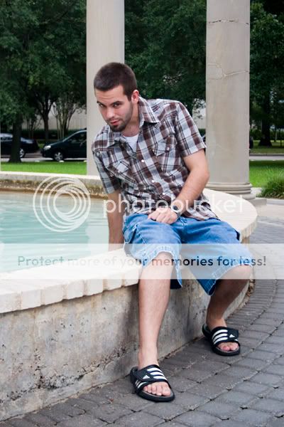
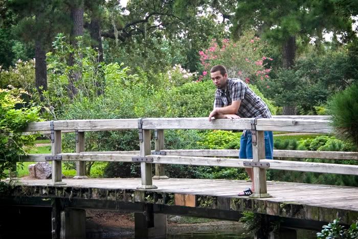
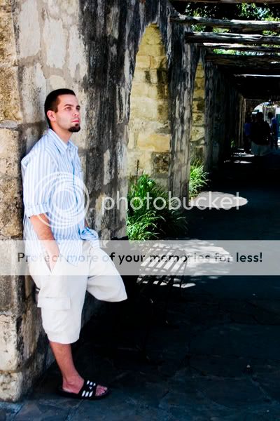
I really really REEEALLY wanted to get some portraiture practice in while on my lil' vacation....Joseph was gracious enough to be my model. :p

I was mostly trying to get better at posing, cuz that's something I suck at....but any and all critique is appreciated!

Oh, and ignore the sky...I know it's bland and blah and blown out in spots. :S

1.
JoeBridge1SM.jpg


2.
JoePillarSM.jpg


3.
JoeGateSM.jpg


4.
JoeFountain1SM.jpg


5.
JoeChineseGardens2SM-1.jpg


6.
JoeChineseGardens1SM-1.jpg


7.
JoeBridgeSM.jpg


8.
JoeAlamoSM.jpg
 
I like 1 (pose) the best.. the only ones I dont like are 3 and 8. The only reason I dont like 8 is because it looks like his leg is chopped off - stil way better than anything i could do though.

nice one.
 
I also like #8 the best...despite the missing leg!

#5 seems a little Photoshopped, the colors and all??
 
I never noticed the missing leg. Hmph. I can bring out a bit of his foot behind his other leg...maybe that will help.
 
I don't think any of your poses are bad, Corry - I like them. Things like noticing the chopped off leg in #8 will come with more experience. You're doing fine! :)

What matters more is the lighting on your model. In most cases Joe's eyes are in too much shadow. Does your camera have a spot meter? Since all "portraits" are about the model, facial detail is crucial. You might want to try to meter off his face and let the rest fall where it will, bracketing as you go and seeing what works.

I know you didn't have an assistant, but even a reflector would have helped in some cases. Note the very successful lighting in #4 - I am willing to bet that the water in the pool was your unwitting assistant in this shot, and threw back just enough light on his face to bring out his eyes and even out facial detail.

#8 also has successful lighting. If you bring up some shadow detail in the right side of the image, that touch of leg showing would probably be more visible and reduce that missing leg appearance.

And, wherever the heck you guys were, it sure was beautiful! Wow! :D
 
Terri summed up what I was thinking. I like almost all of the poses but the eyes being in shadow takes away a bit, especially because Joe has such beautiful eyes! I can't remember if you have an off camera flash for your Rebel, but a bit of fill flash would work wonders. #8 after you work on his leg showing a bit will be a stunning shot! Looks like you had a fun shoot and you can't go wrong with Joe as a model :thumbsup:
 
Post processing is too noticeable. I would've liked to see some close ups. #8 has the best lighting, but too much contrast for me. The leg is an obvious error. These shots either lack contrast, or have too much. The backgrounds are too distracting in most.
 
The first thing that I noticed is that he's not very big in any of them. I'd say zoom in, or better yet, get closer. #7 in particular looks like the type of shot where a wude-open telephoto would be ideal.

I didn't even notice the truncated leg at first... I thought he had it bent, with his foot on the wall-like. Is that what it was?

Keep it up!
 
JamesD said:
The first thing that I noticed is that he's not very big in any of them. I'd say zoom in, or better yet, get closer. #7 in particular looks like the type of shot where a wude-open telephoto would be ideal.

I didn't even notice the truncated leg at first... I thought he had it bent, with his foot on the wall-like. Is that what it was?

Keep it up!

Yup, that's all it was. Thanks for the comments everyone! I think I'll be able to do better next time! :)
 
I tried to do a re-work on a few of these...some slight crop adjustments and other minor things. Any better?

1.
JoeBridge1SMEDIT.jpg


2.
JoePillarsmEDIT.jpg


6.
JoeChineseGardens1SMEDIT.jpg


8.
JoeAlamoSMEDIT.jpg
 
I really like the crop on #2, makes it a much stronger image. I love the pose in #1 but something seems off in the lighting on his face. Overall though I think the edits are a big improvement over the first batch. See your PM, too :)
 

Most reactions

New Topics

Back
Top