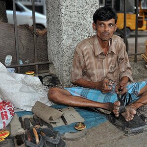
To be honest, I would bin it without even thinking twice. Out of focus foreground is a tricky thing and often does not look good, here we have a strange looking hand that attracts attention and really ruins the image. I am not sure what did you want to achieve with this image with that dark space and overall dark balance, but the overall mood is not positive.
There is some serious serious inconsistency in the grain and sharpening when viewed full size. When viewed as a thumbnail, I love it. Maybe you can have another look at the processing.
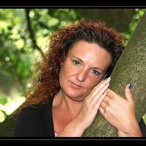
When I look at it again this AM, it looks much much better. Not sure if you changed it or re-uploaded it or something in my computer or the system changed but now it looks great. I love the thoughtful look in her eye, the tonality of the B&W conversion.
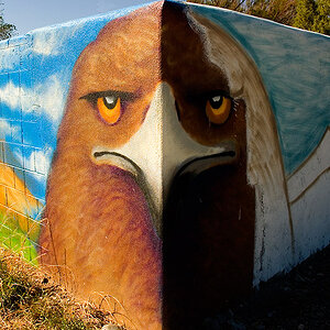
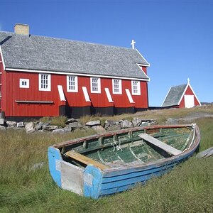
Throw away the entire left hand side of it, and it's a decent photo. That huge dead black space and the distracting and annoying bent whatever-the-heck-that-is object are just killing this shot. As a square, it's okay. Not great, but high technical quality, worth keeping once the distractions are eliminated.


")


![[No title]](/data/xfmg/thumbnail/37/37607-69784b19e25bd0ba68e92ff4cfdfa8ff.jpg?1619738148)

![[No title]](/data/xfmg/thumbnail/37/37608-63b0d340b0972479217b548a4026df96.jpg?1619738149)