Orion_PKFD
TPF Noob!
- Joined
- Jul 16, 2016
- Messages
- 86
- Reaction score
- 60
- Can others edit my Photos
- Photos OK to edit
Hi everyone,
What do you think of these?")
 Bike_billi_bi by André Gonçalves, on Flickr
B&W version:
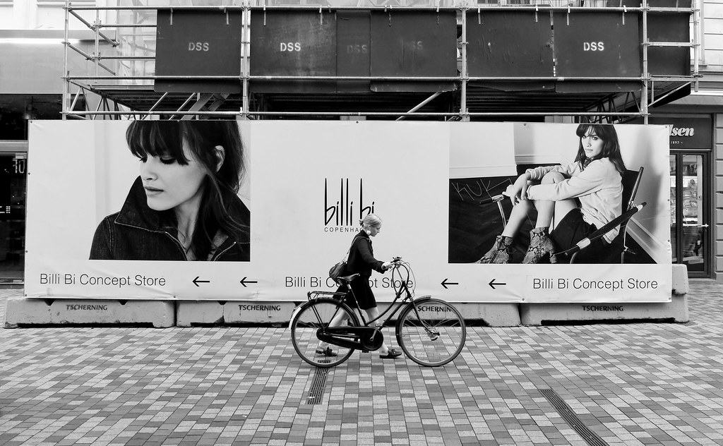 Bike_billi_bi_B&W by André Gonçalves, on Flickr
Another one:
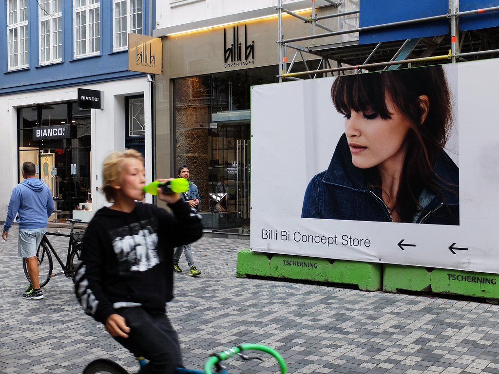 Bike_billi_bi_2 by André Gonçalves, on Flickr
Cheers!
What do you think of these?
Bike_billi_bi by André Gonçalves, on FlickrB&W version:
Bike_billi_bi_B&W by André Gonçalves, on FlickrAnother one:
Bike_billi_bi_2 by André Gonçalves, on FlickrCheers!
![[No title]](/data/xfmg/thumbnail/42/42480-70a0d1b3ccdeb380098dd12f512b4a17.jpg?1619740195)
![[No title]](/data/xfmg/thumbnail/38/38740-d1a7721cf77e9309a9b4a4829c65fdd4.jpg?1619738704)