- Joined
- Aug 27, 2012
- Messages
- 2,289
- Reaction score
- 661
- Location
- Orlando, FL
- Can others edit my Photos
- Photos OK to edit
Hello,
I can still edit these if I need to, so please let me know if anything stands out good or bad to you.
Thank You
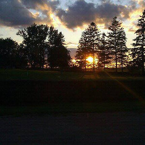
1.
.jpg")
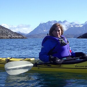
2.
.jpg")
3.
.jpg")
4.
.jpg")
I can still edit these if I need to, so please let me know if anything stands out good or bad to you.
Thank You
1.
2.
3.
4.
![[No title]](/data/xfmg/thumbnail/34/34130-336ba02cc837fdcc84b79f822e841df2.jpg?1619736301)
![[No title]](/data/xfmg/thumbnail/37/37615-78a9bdab877c191919a156f901325ee1.jpg?1619738151)
![[No title]](/data/xfmg/thumbnail/34/34041-c8aed4d2c55b167d1ec03d9cfbaca453.jpg?1619736250)

![[No title]](/data/xfmg/thumbnail/34/34040-14af4007923299ad46d35fc110d0faad.jpg?1619736250)