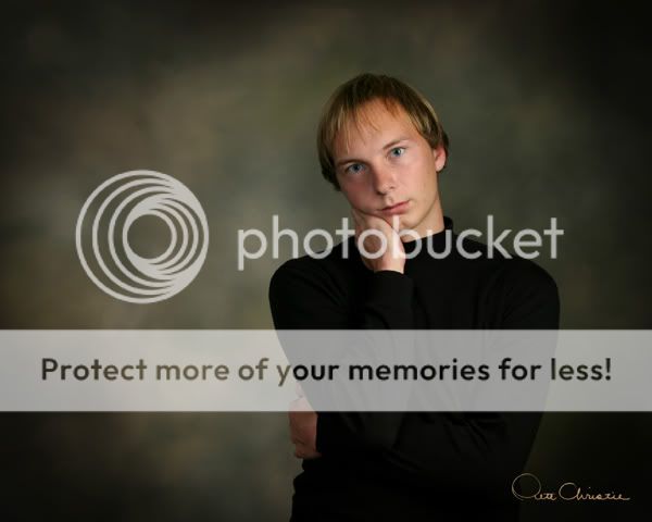
Okay, my first brutally honest critique. But I'll start on the bright side. I like the lack of contrast between the clothing and the background. Now the rest. First, The upper part of the background matches the skin tones of his face too closely, giving not enough contrast. If you're going to drop the contrast of his body, at least bring it out in the face and hair. Second, There's something wrong with the eyes here...they look vacant. Third, The position of his body feels way too awkward to me. There's something about the gripping of the side and the resting of the face on the hand that gives him a really anxious look. Finally, I think there's too much dead space. Sorry for the harsh critique.
") and the pose
and the pose 


![[No title]](/data/xfmg/thumbnail/42/42397-30faa170de7ed9be38adf00b9b26a220.jpg?1734176928)


