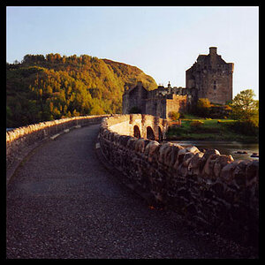
image 1:
lack of saturation, looks washed out
image 2:
this one is great, soemthing seems off, but it's good
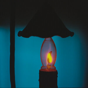
image 3:
great again, I'd try cropping out SOME of the water, but keeping the duck at top right, centered shots are boring
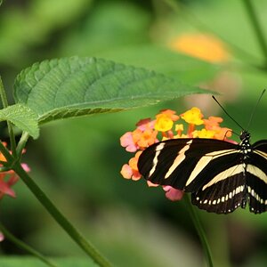
image 4:
seems a little dark, meter for the area under the sky, and use a neutral density filter to keep the sky from being blown out into whiteness.
I have moved your post to the General Gallery. The Photo Critique section is reserved for more serious critique and therefore we like to keep it to one image at a time...(see FAQS),otherwise it just gets too confusing.
Feel free to post multiple images in other parts of the forum...or to re-post your images individually into the Photo Critique section, with a bit of an explanation of the shot and what you were trying to show.


 !
!


![[No title]](/data/xfmg/thumbnail/30/30889-6a35eb14fac2d7d837d49a6a1757d874.jpg?1619734500)
