ShaCow
TPF Noob!
- Joined
- Sep 2, 2005
- Messages
- 878
- Reaction score
- 1
- Location
- UK - England - Birmingham
- Website
- shacow.com
- Can others edit my Photos
- Photos OK to edit
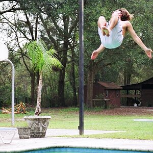
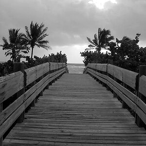
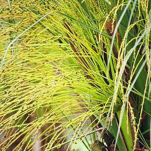
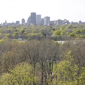
Hi all, ive just finished a very big update to the site, I have fixed all the issues people were having... the only thing that seems to be bugging people now is the google adsense at the bottom of the page..
so, I want your honest opinions about my site, you wont offend me, just be totally honest!
thanka you!
http://shacow.com
so, I want your honest opinions about my site, you wont offend me, just be totally honest!
thanka you!
http://shacow.com
") thanks
thanks