thebasedsloth
No longer a newbie, moving up!
- Joined
- Nov 2, 2011
- Messages
- 350
- Reaction score
- 47
- Location
- Glen Burnie, Maryland
- Website
- www.tmarshphoto.com
- Can others edit my Photos
- Photos NOT OK to edit

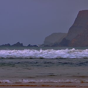
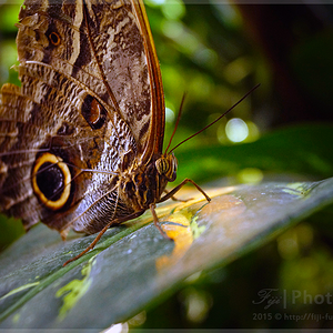
Untitled by TheBasedSloth, on Flickr
CRITIQUE ME SO I CAN SHOW OFF MY EGO AND DISAGREE WITH EVERYTHING YOU SAY.
No but really.. thoughts?