Look its Gaylord!

MohaimenK

TPF Noob!
Joined
Nov 13, 2008
Messages
2,583
Reaction score
11
Location
In between her...
Can others edit my Photos
Photos NOT OK to edit
It's the name of the hotel. Although I believe we caught a lesbian couple there (see below) :lol: I hope 7 pictures aren't too much? C&C welcome. Enjoy

1. The Gaylor Hotel - National Habor, MD
NationalHarbor7-23-2010191.jpg


2. Looking at Woodrow Wilson Bridge from NH
NationalHarbor7-23-2010222.jpg


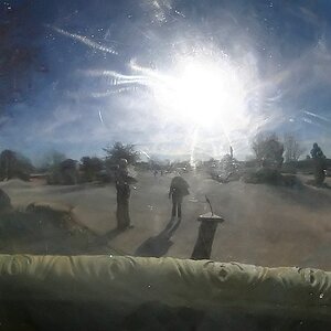
3. Well the picture speaks for itself
NationalHarbor7-23-2010084.jpg


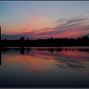
4. Sun set over the Woodrow Wilson Bridge
NationalHarbor7-23-2010105.jpg


5. My wife. Poor baby, was out with me in the 102 degree temperature! :lol:
NationalHarbor7-23-2010079.jpg


6. Just a random gay couple :thumbup:
NationalHarbor7-23-2010118.jpg


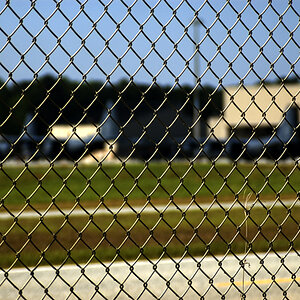
7. This is a football field down the road from my house at a park. Thought it was a nice pic
NationalHarbor7-23-2010249.jpg
 
Absolutely love the first and second photos, very lovely. On the fifth photo I would just align the horizon. =]
 
Very nice. I'm digging 1 and 3. The water is surreal in #1. Wish the boats were a bit more sharp, but I realize it must have been tough with the kit lens.

I brought out the orange 3. Just an idea.

2.jpg
 
I quite like the 4th and the 7th, and not to be rude but cant stand your watermark name stamp thing.
 
Thanks guys for your C&C! TO me, the moon kind of distracts me on the first image so here's a wider shot with more PP done to it. In my OP, I got too lazy to do much PP and didn't sharpen the images. Although I think the horizon might be off just a tad.

Peanut, you don't like the stamp or what it says? Just wondering. It's going to stay regardless :)

Here's a better version of #1

NationalHarbor7-23-2010184.jpg
 
Not sure, i like a more subtle idea. It just distacts me is all. but hey each to their own ya know.
 
Love 1&2 the water looks so smooth it's like silk

Like number 4 too, although i cant place why, i think it would be improved if the boats were easier to see but something about the sun on it attracts me.

Also like the other crop of number 1, both crops work fine, just showing different aspects i guess
 
#1 - great shot except for the blurred boats in the front, but wow that water is smooooth. Shame that the second ver. of #1 has the boats sharper, but lose the vantage of the satin soft water.

#2 simple but great. I also think your watermark branding goes very well with the first two images - says 'metropolitan' to me.

#3 nice shot, not my favorite, but I do like how the sunlight reflecting off the water is coming in at an angle.

#4 - I can't get over the distortion or the seriously lopsided tower right of the sun.

#5 - beautiful picture, just straighten out the horizon as others have mentioned.
 

Most reactions

Back
Top