Mikey Rite

FuryofNature

TPF Noob!
Joined
Sep 18, 2005
Messages
361
Reaction score
7
Location
California
Website
www.furyofnaturephotography.com
Is the slight coloring of this photo working given the subject matter? And do the words on it detract too much from the photo, I was trying to be subtle.

MikeyRite.jpg


Thanks for looking.
_KA
 
Yes, though it seems a little unbalanced to me. And yes, I think the words are a little too distracting.
 
I think words pretty much never work in photography put there afterwards. I think the colouring is ok but is quite strong maybe a bit less of the effect to still keep some colour information.
 
Yeah....I wouldn't normally put words on it, but its for his myspace music page. So I figured it would be good to have his name on it. I tried to make it subtle though.

Is there perhaps a better way for me to do this without destroying the photo?

_KA
 
Pull out the words for sure. The warming filter works alright, but I think the shot would look really cool with a silver/gelatin look to it.
 
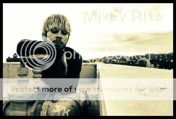
i like the colouring of the image, i think it works well. As far as type goes (this is from a graphic design point of view) i dont think its too bad where it is, but i would be tempted to use the wording smaller, and in the bottom right hand side were the wall is.

Its difficult to know when an image stops being just a photography shot and becomes a piece of graphic design. Using type with image is my job and can be a difficult thing to balence correctly. Most dedicated photographers on here will probably say its too distracting, but it depends on what the piece is being used for. In this case its to promote the musicians name, so it needs to be on there somewere.

So i would try resizing the type and using it near the bottom in either a faded grey or even black. Hope this helps.
 
This is waaay better than the first one...just compare the 2, see how much stronger it is. I may have done it differently, but this is a really good job, you should be pleased with yourself :thumbup:
 
yea they're fine, i like the composition as it is. You could try the leaves a little bigger and see how it looks. If the image, in its final form is smaller than you have it here, they may just look like specks. That would be my only thought, but the overall style is fine. :thumbup:
 
While looking at the original I was afraid nothing could salvage it.
But your edit saved it. I really like the edit. Brushing in the leaves was a stellar addition. Good work
 

Most reactions

Back
Top