Monochromic

WNK

TPF Noob!
Joined
Apr 6, 2006
Messages
1,379
Reaction score
0
Location
The Mighty Midwest
Can others edit my Photos
Photos NOT OK to edit
My still lifes dont normally turn out well... I'm open to criticisms or suggestions on my Monochromatic Theme...

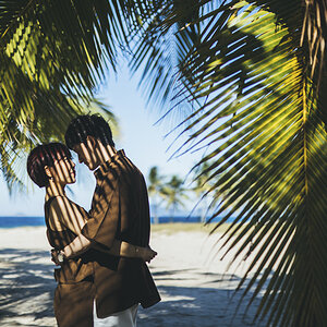
RED
a0ce84e2c4a7936175af1ebb68b70de2-.jpg


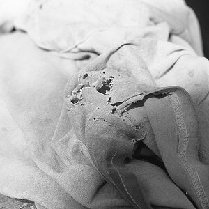
ORANGE
8bf40dd08392c8c4a9ac2c62dbc1bc24-.jpg


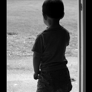
YELLOW
e38d6a52dc77c7668992764cf478f6c2-.jpg


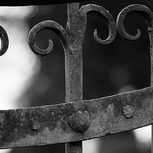
GREEN
1e89e59ca24fedd3caecdba855f876a0-.jpg
 
Yeah, interesting shots. Green is good, yellow is good and orange is ok, but I'm not a fan of where the focus lies in the middle. The red one however, is a bit sad compared to the others. You've got too many other colours in the scene, especially the white detail on the mug - also the focus is a bit off. In the yellow one, there's a thing which needs cropping out on the top LHS of the frame.

Good idea though, the green especially is great.
 
Thanks for your thoughts, Rob... I felt the Red was a bit "off" but couldnt place why... it really is obvious -- too many other colors. You've got a good eye -- thanks! :)
 
i pretty much agree with Rob on everything... i love the concept and the series as a whole, but i think most of them could have used a greater DOF, i know the yellow is supposed to look yellow, but the color still seems a little off... maybe i'm just thinking the paper should be white and it looks like a yellow filter was applied... not sure but good job... :thumbup:
 
JTHphoto said:
maybe i'm just thinking the paper should be white and it looks like a yellow filter was applied

The paper was actually yellow.
Thanks for your comments... I think I'll rework this idea later this week... by the time I got to blue and purple I was pretty dead on ideas anyways. I'll definately keep the "Green" -- I also liked how it turned out... but I think I'll take another shot at the others.
Thanks again for the comments! You guys have been very helpful!
 
Rob said:
....but I'm not a fan of where the focus lies in the middle. The red one however, is a bit sad compared to the others. Y......
Good idea though, the green especially is great.

i gotta agree with that too - good scenes but for some reason with close-ups like this , the foremost objects need to be pin-sharp.
 

Most reactions

New Topics

Back
Top