Mosaic (yet another wall photo)

unpopular

Been spending a lot of time on here!
Joined
May 17, 2011
Messages
9,504
Reaction score
2,002
Location
Montana
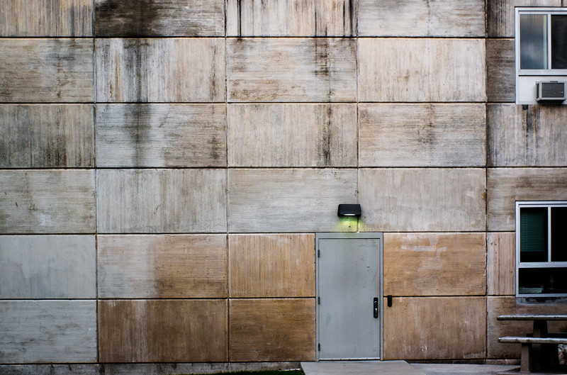
Ok, so it's a little bit of a cliche... but still, let me know what you think.

Also, I'm using Photoshop again after a long hiatus - and that "clarity" slider is pretty darn addictive. Do you think I'm over doing it?
15693672268_bfb4c43ab6_b.jpg
 
Also, I'm using Photoshop again after a long hiatus - and that "clarity" slider is pretty darn addictive. Do you think I'm over doing it?
Not at all. I might have simplified the composition by leaving out the windows on the right, but I like the processing you did.

Jim
 
Nice, but I agree with Jim about the windows. It's much stronger without - more of the minimalist image it's trying to be. Smaller sections of the wall could be interesting as well.
 
And a third: very nice processing but ditch the windows.

I also kept thinking it wasn't level, but it is. So what was tricking me? I'm not totally sure, but here's what I think: there's the slab in front of the door, fine. To the left, there are three sections of wall, all dark. To the right of the slab, there's a section but it's very light. I think that color imbalance is tricking my eyes into thinking it's not level (and this is even after I blocked out the windows with a piece of white paper on my screen to see what it was like after cropping the windows.) Maybe burn that one little section a little to balance it?
 
Like they all said ^^^^^^
 
Now that you mention it, it is a little off. If you look closely at the stuff under the lowest row of wall panels, it steadily gets a little wider towards the right. I think the camera was not perfectly parallel to the wall when this was shot and then the top seam on the wall was leveled. A little skewing or perspective correction would take care of this.
 
Thanks everyone. I actually like the windows a lot, and it's something I do frequently. I have a thing about leading edges. I know, I "shouldn't" do it, but, if you look at my stuff as a whole, I think it makes more sense.

Conceptually, I like this feeling of incompleteness, like there is more here than what is shown, and the tension it creates as a result. This composition in particular would become pretty stagnant I think without something driving that tension. But I appreciate the feedback.

As for the not leveness, maybe. I'll look at the building. It might be that the panels are at an angle, because the door and windows look level to me?
 
Like I said, I think everything actually IS level but the color imbalance at the bottom creates the illusion of a slant. To the left of the door you can see a sliver of grass and that there's a slant to the ground, probably. I'd say even something as simple as cloning that grass out might "even" things out.
 
Very nice -- really like the light over the window. I think I'm OK with the windows but I understand the suggestion to lose them. I'd probably think about cloning out the AC unit and then decide it wasn't worth the trouble.

Watch that bleepin' Clarity adjustment! Don't know if you're overdoing it without a higher-res look. It's a dangerous tool and I see many a photo unnecessarily mangled by it.

I often have this conversation with my students:
Me: "You raised the Clarity value. What does that do to your photo?"
Student: "I don't know."
Me: "Why'd you use it if you don't know what it does? How does it work?"
Student: "I don't know. It makes the photo pop."
Me: "Pop! What the bleep is pop? That's not a photographic term. What's it doing?"
Student: "It adds clarity?"
Me: "That's not a photographic term either. Clueless right?"
Student: "Right."
Me: -- pause to bang my head on table -- "If you don't know what it does and how it works don't bleepin' touch it!" -- back to banging my head on table.

Joe
 
^^ excellent point. I'm assuming it's some local contrast adjustment, probably via an unsharp mask - am I close? Maybe something more sophisticated, a Reinhard variant in 8/16 bit space? Maybe something even more weird, like Content Aware?

I did see what looked like might be a halo artifact on another image I "treated" this way. Not glowing, but maybe some "bleeding" of adjacent tones.
 
And a third: very nice processing but ditch the windows.

I also kept thinking it wasn't level, but it is. So what was tricking me? I'm not totally sure, but here's what I think: there's the slab in front of the door, fine. To the left, there are three sections of wall, all dark. To the right of the slab, there's a section but it's very light. I think that color imbalance is tricking my eyes into thinking it's not level (and this is even after I blocked out the windows with a piece of white paper on my screen to see what it was like after cropping the windows.) Maybe burn that one little section a little to balance it?

Agree, definitely off level. Fix that and either leave the windows out or in. The processing looks fine.
 
^^ excellent point. I'm assuming it's some local contrast adjustment, probably via an unsharp mask - am I close?
Damned if I know, but most likely yes and/or some varriant. I assumed you would have a fair idea and I can't claim I've got better. This is a basic theme in my "digital photo life" -- what's that doing and how'd they do that? Proprietary software vendors don't share well.

Maybe something more sophisticated, a Reinhard variant in 8/16 bit space? Maybe something even more weird, like Content Aware?

I did see what looked like might be a halo artifact on another image I "treated" this way. Not glowing, but maybe some "bleeding" of adjacent tones.

So it falls in the category of micro contrast or local contrast and/or midtone contrast. The best down dirty variation that used to exist before "clarity" was invented was to take an unsharp mask filter and jack the radius way up past sharpening. Another method is to use a high-pass filter again with a substantial radius. And so yep, "halo" is the functional term. That's what establishing a radius is -- creating halos.

DxO uses the term micro contrast although in the newest version 10 just released they have a new and suspiciously related function they're calling "Clear View." Capture One calls theirs Clarity and Structure and provides 4 variants. In other words it's pretty much an established option now.

I'm not complaining that it's bad but that it's typically presented with scant documentation and far too easily accepted without question by the slider wangers (my students). In ACR/LR which does use an unsharp mask method for input sharpening, the Clarity radius can interact in peculiar ways with the sharpening radius. Used with a heavy hand and it really verges on a tone-mapping type special effect.

Joe
 
I have seen the heavy-handed tone-mapped quality of the clarity slider, I do avoid this, though, the instant "that's different" appeal is tempting.
 
As for the not leveness, maybe. I'll look at the building. It might be that the panels are at an angle, because the door and windows look level to me?

It looks level to me, but it also looks like you were pointing the camera slightly to the right rather than straight on. Lens correction filter in PS can fix or reduce this perspective effect. You would lose some of the windows as well. I'm in the camp of losing all of them, but I see why you left them. It would be a different photo without them and, after seeing this version, it would be tough to not feel like something was missing from the shot. It's sometimes difficult to say a change is an improvement in such cases as it really becomes a different photo at that point. I like the shot.
 
Yeah, the whole level thing threw me off for a moment too. It looks like to me that the photo wasn't taken from directly across from the door but from an angle looking diagonally at the door? This might explain the illusion that it's not level? I dunno...Cool wall!
 

Most reactions

New Topics

Back
Top