Dominantly
TPF Noob!
- Joined
- Jul 30, 2009
- Messages
- 3,032
- Reaction score
- 168
- Location
- San Diego, CA (RB)
- Can others edit my Photos
- Photos NOT OK to edit
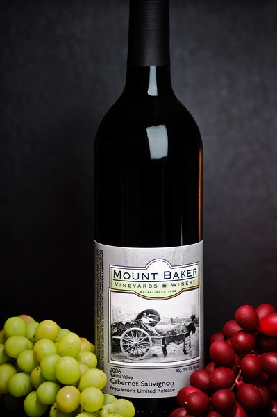
A shot for bottle advertisement.
Follow along with the video below to see how to install our site as a web app on your home screen.

Note: This feature currently requires accessing the site using the built-in Safari browser.
")
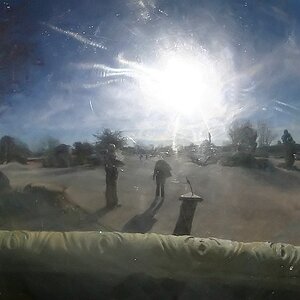
 which is a large leather photo album. but cleaned it up/shaped it already. It would be pretty easy to get that smooth linear light edited in, I will do that for sure, thatnks for the good info! Now I'm very inclined to do a re-shoot. I think I might try something a bit different, but with the same concept. I'll update the thread with new results when they come in.