Newborn/ baby photographer

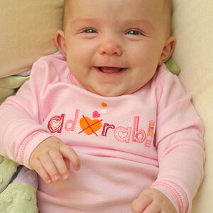
I had my first newborn experience this year. I don t label myself as a "Pro" but i do agree that it takes a good bit of preparation.

In my opinion, newborn photography is in a class of its own and requires a lot of patience. The space heater, pee pads and sound machine worked wonders for me as well.
View attachment 28694View attachment 28695

Some cute shots! Much better than many we see...
 
Look how greatly the color/texture of your jeans vary in the maternity photos. You can see how far the second was pushed in post, the jeans are nearly purple!
 
I'll be honest.. I had a rough time choosing a photographer in my city. There were not many and most were soooooo bad. I won't post links bc I can't be rude like that, but I really found her to be better than others. lol I really wanted a photog in phoenix 3 hrs away but she was out of my price range. The overexposure in the shots was my only issue with her when choosing a photog to go with.. but it was a lesser of evils situation at the time.
 
I also stole those from my facebook, fwiw.
 
he must have been crap 5 hours and no shots

was a she and though of course opinions on photographer's talent are personal opinion, she did really well on our maternity photos so I definitely think it was our son. lol we ended up with 25 photos, not counting some b/w versions on about half the images. she also came back a month later and took some family shots for us since the newborn shoot was so disastrous.

some of my favs:

its not easy to photograph a newborn who wont sleep and cries half the time even with a space heater on him lol


and a few from our maternity shoot with her:

Sorry, but I would have to agree with Gary!

Wonderful subjects... but to be honest, technically... those photos are terrible. They are not well done! It does not surprise me that she was unable to get really good shots of your newborn. As I said... the subjects are great, but the photos do not do them justice! You seriously need to find another photographer! Not trying to be rude... just telling you what I see! It is probably only because this is a really touchy subject that no one else has commented.

Even the processing is terrible.... here is a quick edit on one of them...

mine ................................................................................................... original
View attachment 28817 View attachment 28818

The original you posted is so bright that there is lost detail in the faces....

it looks to me that the photographer was really pushing the high-key look. i know a couple of pro photographers that very much tend to lean this way. it's not quite cup of tea, but that ethereal, dreamy type of look seems to be selling quite well. yes you do lose A LOT of highlight detail, but that's all part of the look. I see this a lot in bridal/engagement/wedding shots. again not my taste, but i do understand the draw, and in the end all that really matters is what appeals to the clients.

although i'm not a huge fan of the high-key look, i really don't care for the edit, at all. the colors are almost posterized. look at color aberrations in the background, on her belly and shoulder, on his hand and by his butt (yes i looked there), or in the highlights on both faces (they look multicolored!). this color unevenness makes for an unrealistic and overcooked look. imo this flaw is by far worse than the loss of highlight detail in the original image.

I know ALL of this has to do with trying to pull color detail from a jpg that's already highly overexposed. and although not necessarily the fault of the editor, for the sake of presenting an example, this edit to me is not the greatest counter-argument for the deficits of a high-key look.

edit: maybe i'm just looking at this at a funny angle on my monitor. from some angles the posterization isn't quite as apparent, although it's still there albeit a lot less jarring.
 
Last edited:
it looks to me that the photographer was really pushing the high-key look. i know a couple of pro photographers that very much tend to lean this way. it's not quite cup of tea, but that ethereal, dreamy type of look seems to be selling quite well. yes you do lose A LOT of highlight detail, but that's all part of the look. I see this a lot in bridal/engagement/wedding shots. again not my taste, but i do understand the draw, and in the end all that really matters is what appeals to the clients.

although i'm not a huge fan of the high-key look, i really don't care for the edit, at all. the colors are almost posterized. look at color aberrations in the background, on her belly and shoulder, on his hand and by his butt (yes i looked there), or in the highlights on both faces (they look multicolored!). this color unevenness makes for an unrealistic and overcooked look. imo this flaw is by far worse than the loss of highlight detail in the original image.

I know ALL of this has to do with trying to pull color detail from a jpg that's already highly overexposed. and although not necessarily the fault of the editor, for the sake of presenting an example, this edit to me is not the greatest counter-argument for the deficits of a high-key look.

edit: maybe i'm just looking at this at a funny angle on my monitor. from some angles the posterization isn't quite as apparent, although it's still there albeit a lot less jarring.

I thought the multicolor was just me seeing it maybe so I didn't say anything on that. lol I'm sure its from what you mention, but yeah. When I first looked at it I was like you really find this BETTER? Generally, a lil more color in the image is what I would have preferred from any photographer, but yeah.. Like I said, if I were a big fat jerk I'd share some of the other local photographers work that I was choosing from.
 
The original you posted is so bright that there is lost detail in the faces....

it looks to me that the photographer was really pushing the high-key look. i know a couple of pro photographers that very much tend to lean this way. it's not quite cup of tea, but that ethereal, dreamy type of look seems to be selling quite well. yes you do lose A LOT of highlight detail, but that's all part of the look. I see this a lot in bridal/engagement/wedding shots. again not my taste, but i do understand the draw, and in the end all that really matters is what appeals to the clients.

although i'm not a huge fan of the high-key look, i really don't care for the edit, at all. the colors are almost posterized. look at color aberrations in the background, on her belly and shoulder, on his hand and by his butt (yes i looked there), or in the highlights on both faces (they look multicolored!). this color unevenness makes for an unrealistic and overcooked look. imo this flaw is by far worse than the loss of highlight detail in the original image.

I know ALL of this has to do with trying to pull color detail from a jpg that's already highly overexposed. and although not necessarily the fault of the editor, for the sake of presenting an example, this edit to me is not the greatest counter-argument for the deficits of a high-key look.

edit: maybe i'm just looking at this at a funny angle on my monitor. from some angles the posterization isn't quite as apparent, although it's still there albeit a lot less jarring.

That is because I was working off of a low res image, that had HUGE loss of detail in the bright areas. I noticed it too... the edit was merely to shot that , and to give a better idea what it could have looked like. It is possible to do high key, without losing that much detail... this is merely overdone, bad photography.

I just assumed that anyone that noticed the posterization would know that it was due to the lost of detail in the bright areas.... it is pretty obvious that the areas correspond. I am surprised you even felt the need to comment, since it is so obvious.....
 
Last edited:
it looks to me that the photographer was really pushing the high-key look. i know a couple of pro photographers that very much tend to lean this way. it's not quite cup of tea, but that ethereal, dreamy type of look seems to be selling quite well. yes you do lose A LOT of highlight detail, but that's all part of the look. I see this a lot in bridal/engagement/wedding shots. again not my taste, but i do understand the draw, and in the end all that really matters is what appeals to the clients.

although i'm not a huge fan of the high-key look, i really don't care for the edit, at all. the colors are almost posterized. look at color aberrations in the background, on her belly and shoulder, on his hand and by his butt (yes i looked there), or in the highlights on both faces (they look multicolored!). this color unevenness makes for an unrealistic and overcooked look. imo this flaw is by far worse than the loss of highlight detail in the original image.

I know ALL of this has to do with trying to pull color detail from a jpg that's already highly overexposed. and although not necessarily the fault of the editor, for the sake of presenting an example, this edit to me is not the greatest counter-argument for the deficits of a high-key look.

edit: maybe i'm just looking at this at a funny angle on my monitor. from some angles the posterization isn't quite as apparent, although it's still there albeit a lot less jarring.

I thought the multicolor was just me seeing it maybe so I didn't say anything on that. lol I'm sure its from what you mention, but yeah. When I first looked at it I was like you really find this BETTER? Generally, a lil more color in the image is what I would have preferred from any photographer, but yeah.. Like I said, if I were a big fat jerk I'd share some of the other local photographers work that I was choosing from.

As I mentioned... I didn't have much to work with. Those highlights were BLOWN! Personally, I would not let that photographer take photos of anything... but that is my opinion. I am positive you could do as well, and probably better then she did.. using a tripod and a remote trigger or self timer!
 
I just assumed that anyone that noticed the posterization would know that it was due to the lost of detail in the bright areas.... it is pretty obvious that the areas correspond. I am surprised you even felt the need to comment, since it is so obvious.....

i know exactly what it's from and i stated it. my comment isn't that posterization happened (although there are ways to alleviate it), it's that since it was so obvious that it would happen, it wasn't the best idea to present this edit as an example of how the original shot was deficient. all my opinion though ymmv. i'm not claiming to be a majority voice either, but i don't think i'm the only one who would think that that edit looks substantially worse than the original.
 
I thought the multicolor was just me seeing it maybe so I didn't say anything on that. lol I'm sure its from what you mention, but yeah. When I first looked at it I was like you really find this BETTER? Generally, a lil more color in the image is what I would have preferred from any photographer, but yeah.. Like I said, if I were a big fat jerk I'd share some of the other local photographers work that I was choosing from.

you shouldn't second guess what looks good to you. it either looks good or it doesn't, that's the easy part. the hard part is trying to figure out why things look good to you (or your clients), and use that to generate good images.
 
Last edited:

Most reactions

Back
Top