Pastels and Watercolors (and a few other art media)

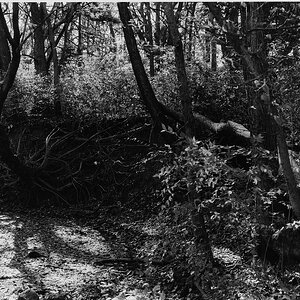
Thanks. That's what we want - more light.

Once the crap is out of there, I'll take some progress photos. I need to find (or replace) the charger for the D750 and recharge the dead batteries; that's the main reason I haven't been doing any real photos.
 
Last edited:
I’m very annoyed with myself for using the wrong color for the deep shadows, too purple. They wouldn’t blend in after that and I ruined it trying to darken the mid tones to compensate. Otherwise this was a good lesson from Anna Mason Nature Studios - she teaches realistic watercolors.

IMG_7224.jpeg
 
When I took a series of hand coloring classes many years ago, the instructor really beat it into our heads to use "purple in the shadows!" So this looks fine to me.

Now, purple can swing blue or red, and maybe a deep blue purple would look better to you. This looks like a reddish one. You probably have both shades. Just a thought.

Great job on those petals - you nailed the light. Don't be annoyed with yourself, this is gorgeous!
 
I’m like a 5 year old lately jumping from one interest to another. I’ve been wanting to try alcohol inks for a while and finally gave it a go today. I REALLY like this medium. It was fun and frustrating but mistakes are easy to fix - in fact you can wipe the whole thing clean if you don’t like it or are just practicing. These are on plastic poster board which is so cheap! Made with a hand blower - it’s like a giant dust blower bulb.

IMG_7269.jpeg


IMG_7270.jpeg
 
I love these two.

When you pick out a beginning color palette, pick between 10 and 12 colors: warm and cool each of red, yellow, and blue; a black or grey, a brown or two (again, warm and cool). if you are interested in landscapes, get a couple greens (warm and cool). Then add as your need change. By going warm and cool, your secondaries will also be warm and cool, as you need them.
I got an eight color set when I was at Blick’s last weekend. And then I grabbed a gold to sort of round it out. It did not come with the purple, so I’ll definitely be mixing. Even after just this one short session, I realize that I need a bunch of different really small, micro brushes, and small cups to mix in. I may just use some old shot glasses that we have here that we don’t use anymore now that we’re all old lol Also need to find Some smaller tips to go on the alcohol ink because it’s dropping down too much with these little drop bottles. I’ll need to get the ones with the needle on the end.
 
I have a couple little plastic cups with screw-on lids that work well for ink. I think I got them from Michaels.
When I do the fountain pen ink as a wash, I would use a dip pen , then a water wash. As far as brushed - a #6 round is my JOAT, maybe add a #2 for fine details.

I like either of these for drawing - small round nibs (B5 is a bit arger than the B6) and any "straight" holder.
 
These cups would probably be fine for inks. You can cap the mixes.
 
One more… I could sit here doing this all day. So much fun. I’ve been trying to get this result with watercolors for 3 years. I guess I was using the wrong medium.

IMG_7273.jpeg


The safety gear is certainly attractive.

IMG_7275.jpeg
 
Safety gear? :icon_scratch: From using a blower on the inks? I'm confused.

Regardless of that, these are stupendous! I love the results. I can see a watercolor vibe here, but it has almost a 3-D effect, too. Love these!!

And of course, you must get whatever more colors or supplies you need. That goes without saying! :1247:
The fumes from the 91% isopropyl alcohol used to activate and the ink and move it around can cause headaches (which I’m prone to with any type of fumes) and also respiratory issues if you breathe too much of it in. I had an exhaust fan in the window and wore the mask about half of the time - it’s pretty comfortable and no foggy glasses. Plus I’ll be ready for the next pandemic. 😷
 

Most reactions

New Topics

Back
Top