- Joined
- Sep 2, 2003
- Messages
- 34,551
- Reaction score
- 7,573
- Location
- In the mental ward of this forum
- Can others edit my Photos
- Photos NOT OK to edit
Okay, I'm starting this thread so I don't interfere with @snowbear and his ink work thread, even though he invites me to hijack it periodically. 
I started messing around with oil pastels as another medium for hand coloring B&W photographs. I never really warmed up to them for that, though. Unlike actual photo oils, which are made to be transparent enough to allow the photograph to show through, oil pastels are quite opaque - like crayons, which they resemble. When I first had a play, the idea of actually covering the photo and having to do any drawing myself to make sense of the image was terrifying. Drawing is not my forte, and I've had scant training.
A couple of them *kind of* worked, but meh.
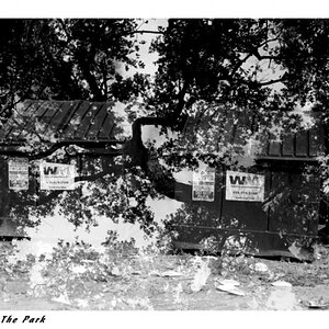
Here's one of the first things I tried. I had a photo I took on a very bright day with a Holga - limited camera controls, so it's totally blown out. But the negative did at least show this very cool, ancient electric plant built on Lake Superior:

Horrible negative, with nothing good to come from it. I scanned it anyway, and printed it out to try again with the oil pastels, just made it more a nighttime scene:

So, not a total loss of the negative, but not very good, either.") Since then, I've just tried to get away from using bad photos to paint over, and figuring out how a non-painter/sketcher like me could still have fun with a medium like this.
Since then, I've just tried to get away from using bad photos to paint over, and figuring out how a non-painter/sketcher like me could still have fun with a medium like this.
In my own little art journey, I've been studying some of Picasso's work and doing some reading. I never liked much of his stuff (and I'm still not a huge fan of analytical cubism - the earlier form of this style), but I do like quite a lot of his other work, especially portraits. It seems very liberating to not have to think about being anatomically correct.
With this in mind, I decided to use another one of my photos for a reference - which, btw, is actually a B&W photo that I took of my husband and later hand painted with photo oils. (Why yes, I did have to mention that. The skin tones and hair came out great!)
Here's the photo:

And here is the oil pastel painting I made from it, Picasso-style:

I wasn't going to try to draw any of that background or do anything, really, too much like the photo. So it was just a lot of fun - and btw, he loves it! So I view this one as a success.
I've scanned or photographed most of my stuff. Oil pastels can be slick and messy, so not much scanning anymore. Most of what I do is from some kind of photo reference, though not all.
I started messing around with oil pastels as another medium for hand coloring B&W photographs. I never really warmed up to them for that, though. Unlike actual photo oils, which are made to be transparent enough to allow the photograph to show through, oil pastels are quite opaque - like crayons, which they resemble. When I first had a play, the idea of actually covering the photo and having to do any drawing myself to make sense of the image was terrifying. Drawing is not my forte, and I've had scant training.
A couple of them *kind of* worked, but meh.
Here's one of the first things I tried. I had a photo I took on a very bright day with a Holga - limited camera controls, so it's totally blown out. But the negative did at least show this very cool, ancient electric plant built on Lake Superior:
Horrible negative, with nothing good to come from it. I scanned it anyway, and printed it out to try again with the oil pastels, just made it more a nighttime scene:
So, not a total loss of the negative, but not very good, either.
Since then, I've just tried to get away from using bad photos to paint over, and figuring out how a non-painter/sketcher like me could still have fun with a medium like this. In my own little art journey, I've been studying some of Picasso's work and doing some reading. I never liked much of his stuff (and I'm still not a huge fan of analytical cubism - the earlier form of this style), but I do like quite a lot of his other work, especially portraits. It seems very liberating to not have to think about being anatomically correct.
With this in mind, I decided to use another one of my photos for a reference - which, btw, is actually a B&W photo that I took of my husband and later hand painted with photo oils. (Why yes, I did have to mention that. The skin tones and hair came out great!)
Here's the photo:
And here is the oil pastel painting I made from it, Picasso-style:
I wasn't going to try to draw any of that background or do anything, really, too much like the photo. So it was just a lot of fun - and btw, he loves it! So I view this one as a success.
I've scanned or photographed most of my stuff. Oil pastels can be slick and messy, so not much scanning anymore. Most of what I do is from some kind of photo reference, though not all.
![[No title]](/data/xfmg/thumbnail/32/32945-a29b33c040ad72e4b783ea5e431cec65.jpg?1619735778)
![[No title]](/data/xfmg/thumbnail/30/30882-ce388519574371448d7493784524607a.jpg?1619734495)