Pieta

Johnboy2978

No longer a newbie, moving up!
Joined
Oct 21, 2004
Messages
1,797
Reaction score
30
Location
Southwest Virginia
Website
www.johncountsphotography.com
Can others edit my Photos
Photos OK to edit
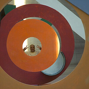
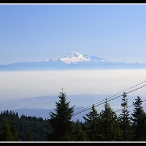
The seminarian at our church is being ordained as a deacon in a couple of weeks and my wife thought that it would be nice to do something for him. She thought that he might like to have one of these framed, so I thought I'd once again turn here for opinions.

I think overall, I prefer the color, though I'd really like to do b&w. I just don't think that the conversion did very well. Thoughts, comments, and brutal attacks all welcome.

PietaWeb.jpg


PietaWebBW2.jpg
 
The black and white is a lot less flat that the colour approach. Which is why I - a colour person normally - would prefer that one over the first. Contrasts, depth, all comes out better.

There are three quite distracting bright spots in both versions, though, the stone on the righthand bottom, the - whatever it is - right next to The Virgin Mother's head, and that part of the background to the let which is lit by some spot light. Maybe you would want to work on that just a bit? (The thing next to The Virgin Mother's head needs to be worked on!)
 
The first thing I thought was.. "Black and White". I've done another version for you which I think does it more justice. Let me know if you want me to e-mail it to you?

Rob
 
I think i prefare the colour one, the statue itself is almost mono anyway so the background oranges and browns add a nice warmth to the picture.

Maybe you could clone out the white bits that LaFoto mentioned.

Also I think it would have benefited from a shallower depth of field, enough to blur the background slightly, but maybe you could do this in photoshop?
 
Here's an attempt at how I would start doing it in PS. Hopefully you can get the idea and do it how you want it (if you like it in B&W!).

PietaWeb.jpg


pietaweb.jpg
 
Thanks all. Ultimately, I went with the B/W. I took the suggestions of those who had an input and burned the small area above Mary's head and also that area on the left center and sent it to MPix for printing. I think it will come out nicely.
 
I think you should leave the distracting elements... they form a triangle and the eye keeps looking at the picture longer...

pure IMO of course
 

Most reactions

Back
Top