 DSC_9046
 by
MandyRojasPhoto, on Flickr
Help me grow!
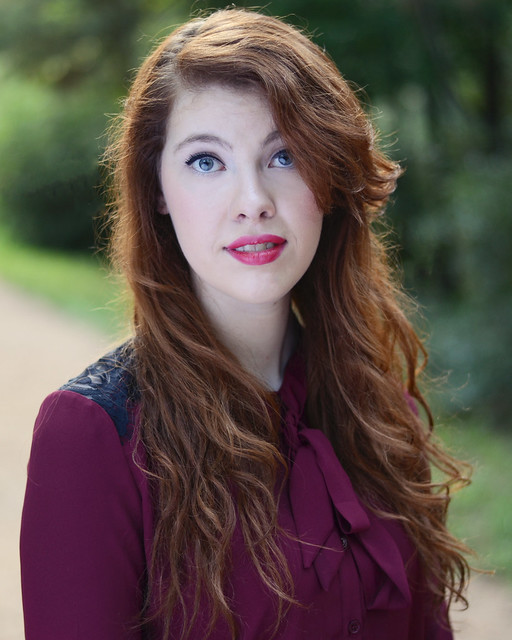
Looking at this shot, I think that she's too high in the frame. Her eyes are almost 7/8 of the way to the top of the frame, and the top of her head almost touches to very top of the frame, which causes unwanted visual tension in an otherwise quiet, direct eye contact portrait. As to the skin coloration: I can believe that as a redhead, she might have pale skin coloring, and she might be using a very pale foundation and very light contouring, which with that lip color makes her have that milky color that some people happen to like, especially on redheads.
I think the added warmth shot above [the edit] looks too far toward the yellow, with the greens heavily tinged with yellow, and the concrete also looking very yellowish. The original shot's color looks cool, as open shaded light often tends to look, and it has the cool skin tones that remind me of Ektachrome slide film, which tended to look "coolish", like your original shot does. I like the red hair color rendering in the original shot, but I think the skin tones could stand to be darkened a bit, and left cool if desired.
Judging by the whites of her eyes and her teeth and the greens, the original shot's coloration looks pretty good to me, except the skin looks a bit too pale, too bright. Maybe that's a matter of contrast though, more than actual measured brightness; the shadows inside her hair are very dense, so I think the skin looks unduly pale in some measure due to the degree of contrast this shot has. Again...this images looks a LOT like an Ektachrome 100 Professional slide shot, with light highlights, and very dense shadows, and rather subdued mid-tones.


