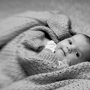
Having the whole of the face sharp I think would have been better, perhaps even just one stop closed and some modest tilt in order to pull the attention from the shirt - which I think is already distracting; a simple stripe pattern would be better, or even a solid dark grey knit at Zone 3-4 would have been better?
I found it very "symmetric" and in combination with the stripes from the shirt make it a little confussing and distracting as unpopular says , it has too much contrast ( this could be fixed in the dark room with filters...)
The symmetry and high contrast is a personnal choice, but doesn't seem to work for everyone. Thanks for your comments, they are pretty much appreciated !


![[No title]](/data/xfmg/thumbnail/42/42061-9f4eb186c434652d6587c8bcdde59502.jpg?1619739997)
![[No title]](/data/xfmg/thumbnail/34/34133-7a1339dcac8b8cda8f7e1e4b6c828ccb.jpg?1619736305)

![[No title]](/data/xfmg/thumbnail/34/34134-d2249816e46b705693bfc543c9b1f481.jpg?1619736306)


![[No title]](/data/xfmg/thumbnail/36/36657-3774cdd7ebbafa5ccac2741386b9949a.jpg?1619737675)