promised him prints

KunalShingla

TPF Noob!
Joined
Dec 15, 2005
Messages
197
Reaction score
4
Location
New Delhi
hi guys this is my 2nd post in this forum...
hope u enjoy it....
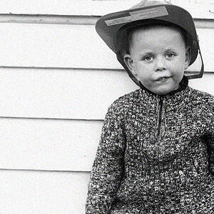
This guy working at the Qutab minar area. After a couple of shots he noticed me taking his pictures so got a bit conscious but after i sat with him and promised him that I am going to come back and give him the prints he was ok with it....
IMG_0156.jpg


IMG_0168.jpg


IMG_0170.jpg


apart from how the photos r i wud also like to know from everyone if they cud tell me how i could improve on my photos since i am very new with photography and thats the reason y mansi has made me join this group....
 
:thumbup: really like the second one!!
 
If you mean general post processing then there are a few things you can do in general to 'jazz up' a picture.

1) This photo is maybe a tiny bit overexposed. It's not that contrasty or saturated. The colours could be richer and it could have more of a range of tones. maybe also a bit of sharpening.

2) This can be alot better It hink with some curves or contrast work. The composition is nice and the photo is pulled down a bit by the muddy, musky dusty look to the overall thing. That can be fixed easily.

3) Needs the least work. just general addition to contrast and saturation.

I can post up what I mean uf you want in edited form of these pictures but only if you want.
 
Daniel.......thanku sooooo much this is what i wanted to know from people and apart from that how could i have shot the photo to make it better.....
actually i still haven’t started working on the photos on Photoshop as yet....will be doing that in a months time when i have a faster computer.
these r totally raw photos...but gr8 u hear ur comments and if the effort is not much then u can edit it and show....
thxxxxxxxx once again
 
This is what I would probably do but it fis my tastes. you might want something different from the pictures. They are great pictures I enjoyed doing this.

guy17uj.jpg


guy28tl.jpg


guy34hk.jpg
 
hey daniel
nice work man
i like it....
now lets see wat others also have to say bout it...
thx
 
Nice composition and DOF. It perhaps does need a little more saturation but I think Daniel's version has too much. Yours looks much better in my opinion. I think my favorite one is the first one - all are nice though.
 
Calliope said:
Nice composition and DOF. It perhaps does need a little more saturation but I think Daniel's version has too much. Yours looks much better in my opinion. I think my favorite one is the first one - all are nice though.
Agree with linda here.
Your first versions do need a contrast boost and some sharpening.
My fave is the second. I tweaked it a bit in PS and it came out nice. Love the light being filtered by the dust/haze? in the air.
Keep at it kunal. Neat to see yours and mansi's diff. views of Qutab (as well as many other's I've seen). It's quite the incredible structure and the grounds look equally impressive.
 
nice pics to start with and you've done a good job, but i also like the saturation daniel has added
 
hey all
a very happy new yr....
well its early in the morning....mayb thats the reason for this filtered light.
i have news ppl----->the 1st photo is 99% selected for an exhibition...ppl now i want more very serious opinions as to how i can change the photo and then put it up....
thats all for now...
thx for all the responces...it feels gr8...
thx
 
Calliope said:
Nice composition and DOF. It perhaps does need a little more saturation but I think Daniel's version has too much.
I like the contrast in Daniel's, but that's really all I thought was lacking in the original. The saturation dit get to be too much in the new ones. I, too really like the second one. Bump the contrast (or use curves) and you've got a winner :thumbsup:
 
oooohhh... these are all great, but like the others have said, just needed a boost in contrast to make them pop a bit.

i played with them a bit.
please let me know if you'd like me to take them down.

jj5g76


jj5hs7.jpg


jj5n5d
 
this is amazing...the replies.....
calliope- thx to u too...now u have more photos to choose from..:)
hope u dont mind it...
jonk-wat do u have to say bout it now ?
errant star- i'll try to post more wheneve i shoot more of this type..as of now..i got something different....shud post it soon..
duncanp- thanku to u too...we have more options to choose from...
clarinetJWD- thanku to u too...u wrote some nice words there...thx
kalee- i dont want u to take them down...not at all....i like these the most...wat say daniel...hope u dont mind....but i like these slightly more.....
the best part is the 1st photo in this will be put up in an exhibition called "romancing the bylanes"....this is really helping guys...
wanna really really thank everyone specially daniel and kalee the most....its a gr8 experience to learn from u ppl..i dont get to understand how u do it on Photoshop till i start PS....till then...i'll keep posting these raw photos...and i am sure u ppl r here to help...thx once again....
 
Hey Kunal, this is really nice stuff. The contrast stuff as you must have noted by now is a very individual thing. but yes i think a majority of people would prefer it a bit like what Kalee has come up with - specially in the thrid one (the close-up). But like i said, its individual preferences. I can imagine you there on these foggy delhi winter mornings and the purple shawl standing out in the mist! I think i can see the effect you were trying to capture and for that you'd have to over-expose another stop:lmao: Its kind of like with snow you need to over-expose as the camera darkens it (making even lovely fresh snow look days old :( ), trying desparately to average everything to 18% grey! Definitely keep in mind what people have to say but dont let any of us change what you like, because that is you and it'll be your style. No point me shooting like kunal and kunal shooting like me :) Since you requested me to tell you how i may have shot the same...in the 1st i may have reduced the space left behind the guy and increased it in front of him - just a weeee bit, then raised the camera position a bit higher to give a feeling of lil more depth between you and the monument in the bg. In the second i may have included a part of his eye (i have something with eyes :) ) and the third everything else would be the same except i may...have framed his face only with the tree further back and kept the closer, darker, one more only in the left corner. BUT then like i said that would have been mohit's pics and not kunal's.so stick with your style.As long as you have your basics right - rest is all individual choice:mrgreen: Not much help was i ?!
IMG_0156.jpg

me no great shakes at PS either but trying to imagine a delhi winter morning - only dont know how to increase the foggy effect like i'm sure it must have been ;)
 

Most reactions

Back
Top