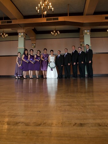
#1 I understand the intent to want to frame them in a unique way, but to pull off this shot, you need a foreground that is more interesting than the one you have in the picture. Might work well with some grass and having a foreground object (bride's bouquet?) to help tie the whole thing and set perspective for the viewer.
Technically, its nicely exposed, good colours. I just don't like the location or the composition
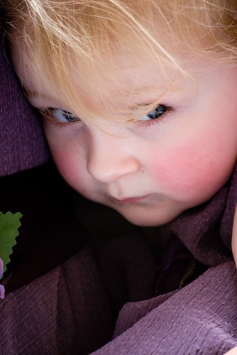
#2 While not wedding themed, I like this picture. Nice overall composition and sharpness on the eyes. I don't like the piece of hair over her eye and there is some green detailing on the left hand side that is irritating. Nice shot though
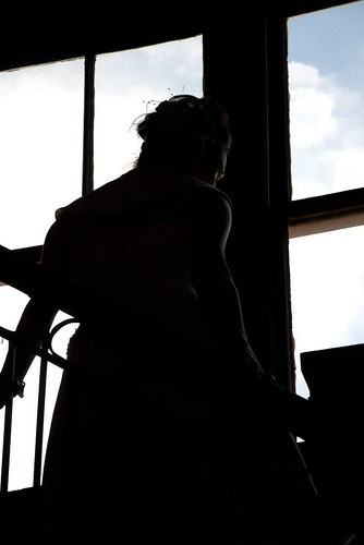
#3 I agree with the above comment that the background kinda breaks the silouhette, mainly the railing on the lower left. Nice job on the lighting though, getting just faint light on her face to seperate her from the frame of the window. Not a fan of the overall composition
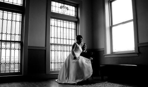
#4 Great concept, I also like this one. A few things to consider, and this is just personal opinion, is the choice of windows. I love the texture / details of the windows on the left, but don't like the one on the right. I find this right window a bit too dominating in the image. Maybe at a different angle, using the left two windows as a background?
I don't mind the space overhead too much, although it could be brought closer a bit. Or maybe adding in a bit more floor (which would remove extra space up top). Her face is also a bit underexposed and the guy looks a bit smothered under her.
Nice job overall though. Its great to try new things, its the best way to learn. Kudos to you for doing so.


![[No title]](/data/xfmg/thumbnail/31/31978-02cde49248ebdf1b82fba5c899e08378.jpg?1734160755)


![[No title]](/data/xfmg/thumbnail/30/30879-16ad830465e571dee0a784c7fa122909.jpg?1734158876)

