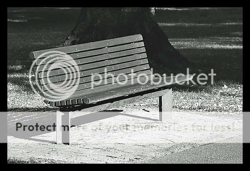
I don't know why I like this photo, but I do. I think its cause it has such good lines in it. And the sunlight being straight on the front really works, cause then the shadow lines up in back.
Very cool. And the name is fine. It was really either that, or "Life's a bench"
Have to say I'm not a fan. There are no smooth tonal transitions. It just goes dark gray...middle gray...blown out. I'm all for simple subjects but I don't see anything particularly interesting about this bench or the way its represented. I also find the tree trunk immediately behind it to be rather distracting; or at least it adds nothing to the shot.


![[No title]](/data/xfmg/thumbnail/31/31752-fcbc5aa4a94154b9c273592aa37b8b1e.jpg?1619734991)


![[No title]](/data/xfmg/thumbnail/36/36665-7c494bf98537fba5ac87ac5ad6bda658.jpg?1619737676)