- Joined
- Apr 14, 2013
- Messages
- 2,677
- Reaction score
- 2,044
- Location
- India
- Website
- www.rajarshiphotography.com
- Can others edit my Photos
- Photos OK to edit
Hey guys,
I read in some thread at TPF that you aren't a real photographer if you don't have a web site. Well here goes: Rajarshi Photography, my new website I just created yesterday at zero cost. I know, not very special.:er: But still some feedback would be nice.
I'm not really looking to go professional(not yet), and not considering buying a domain, or a dedicated host. Other than that any suggestions are more than welcome.
Specifically I was thinking whether I should include that facebook like & the facebook/flickr links or not. Any design ideas are more than welcome too.
-And sorry for the annoying ads
Last edited:
")


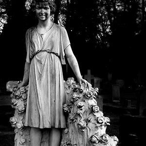
![[No title]](/data/xfmg/thumbnail/40/40285-2ce5915035c220ccb3485030863b62d0.jpg?1619739408)
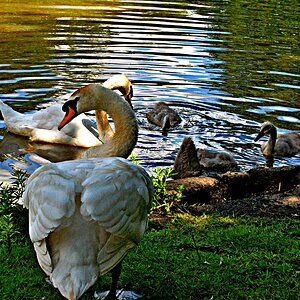
![[No title]](/data/xfmg/thumbnail/40/40286-86401b94de8b01bea8bb4ea154aaea0a.jpg?1619739408)
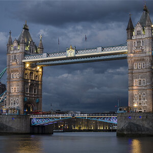
![[No title]](/data/xfmg/thumbnail/40/40287-4f839095000f74d779b90ed75df9dc62.jpg?1619739408)