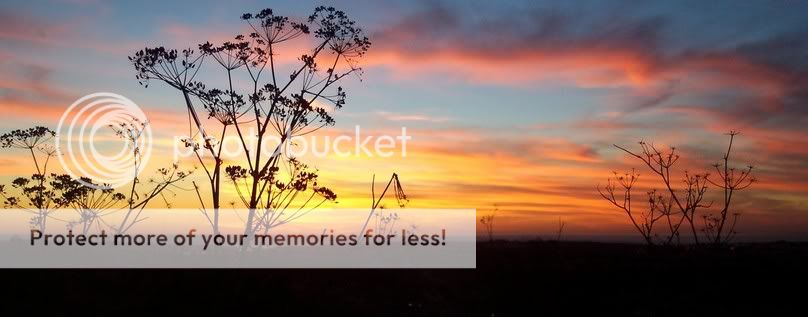
Pleasant colours, pretty silhouettes, but you need a subject for your background. This is a great example of a YAPP, Yet Another Pretty Picture. But why? By the way, when you post a really wide photograph, most people won't be able to view the entire image at once. It also makes the resulting text really hard to read because everyone has to keep scrolling from side to side. This is especially annoying when posters don't use line breaks and instead write long blocks of text,
like I'm doing.
Nice shot - but the horizon needs to be much lower almost at the bottom. The big lump of almost black with no real detail overpowers the picture and destroys the balance.
Put a piece of paper along the bottom to mask it and have a look.
Cutting off the bottom helps. I would be happier if I saw some detail in the "weed" most of it looks out of focus (but then it could be my eyes). Very pleasant and warm.
Personally, I really like the new version of the pic. Not sure if it was intentional, but I really like how the weeds and the clouds both seem to move in a direction toward the upper right side of the photograph, keeps your eyes moving from left to right.
The only thing I would change (and this is not really a big deal) is the crop on the left side. The bush is cut off a little while there is extra space on the right side.