The lost Cargo

jovince3000

Fried potato lover
Joined
Apr 20, 2015
Messages
224
Reaction score
62
Location
Montreal, QC, CAN
Can others edit my Photos
Photos OK to edit
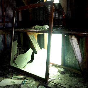
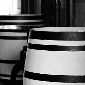
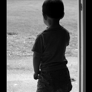
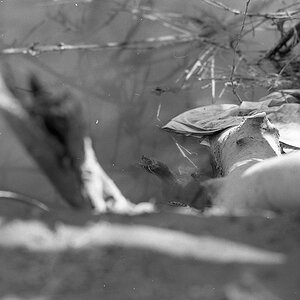
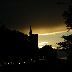
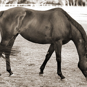
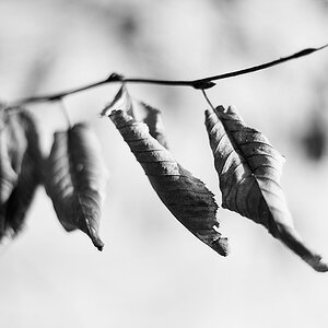
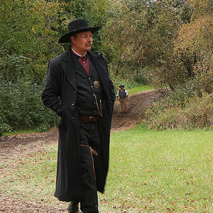
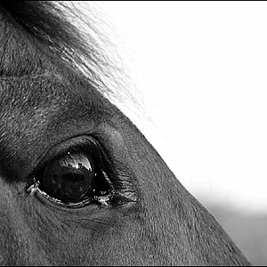
Hey there, first work I publish on the forum ; I hope it's worthy as I have no background comparing my work with other photographers. for the ocasion, I went FULL BLOWN akward, I'm not used to black and white at all, I hope this work.

Peace ^^


IMG_1350-Edit-Edit.jpg
 
Good range from black to white. Leading lines. Film or digital ?


Sent from my iPad using Tapatalk
 
Well, it might work. Actually I like the harshness of this scene. It causes emotions, some strong tension in the atmosphere.
What I do not like is your signature or rather it's placement. It looks like some huge artifact, it looks bad in that place. :icon_frown:
 
Agree with Timor. Good tonality. Very gritty. Great shot. Agree with the sig too.
 
Yes it could work, but there are two areas you could improve. The whole image leans to the left, there are few verticals that don't. And the artefacts from the cloning in the top right are far too visible, there are some tricks you can employ here. The repeating pattern is very noticeable and as a regular pattern is a magnet for the eye, lessen it by using a soft edge brush and a few samples from all over the image overlaid on it. I also have a suspicion you sharpened the image before you cloned (?) which highlights the differences in texture.
 
Good range from black to white. Leading lines. Film or digital ?

Digital ^^, I process my image in lightroom and photoshop.

Thanks for all the imputs. The signature on my IPS screen seemed way better that on my current TN screen, I will redo it and place a normal signature when I get back home.

For the cloning and the sharpen, Tim, you are totally right, I didn't even noticed the difference in texture, rookie mistake I shouldn't have made. I also don't know what went through my head when I sharpened before cloning. Thanks a lot. I will come back with a V2 today most likely with all of this in mind.

Sadly for the vertical line that trend to the right, that's a terrain issue, the ground there is uneven, and the fact that the street behind where you see the buildings angle down down the road doesn't help. Sadly I have no idea how to correct it, any pointers ?
 
Sorry for the double post, I finished the V2 I think it came out very well. What do you guys think?

- I went and reshaped the left horizontal line to match better with the vertical line of the train.
- redid the sky
- redid the signatures, much simpler, cleaner and placed in a less conspicuous way.

IMG_1350-Recovered.jpg
 
Looks much more pleasant now. Picture gained better balance IMO.
 
Yes, the image looks more complete now. I pulled down the image and straightened it myself before suggesting it, and though I ignored the train (they rock back and forth anyway), I found that correcting to absolute was a little too much. The image likes a slight tilt to the left.
 
thanks for the comments again, Tim I totally see what you mean. When I started to straighten the line of the horizon, I first tried to bring it back to absolute level, it felt an awful lot like "too perfect" and artificial in this case. So I brought it back just a tiny little bit to get rid of that effect. I feel like I still pulled out a little too much though. But I'm satisfied with the final result so I think I'm gonna go with it, the edits on that image took me about 5 hours (the fact that photoshop crashed TWICE on me didn't help too).

Thanks again for all the pointers, if you still see something to be corrected or that I could do better on the next one, please don't hesitate ;)
 

Most reactions

New Topics

Back
Top