Thoughts on my logo?

MOREGONE

No longer a newbie, moving up!
Joined
Sep 13, 2012
Messages
875
Reaction score
195
Location
Tempe, AZ
Can others edit my Photos
Photos NOT OK to edit
Hello,

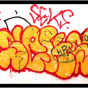
I am getting to the point where I want to start ordering custom thumbdrives and marketing materials for my clients. Before I do would appreciate some feedback on my logo.

Please let me know if it looks professional, is something you would expect to see on a wedding photography site etc..

Thank

logo.png
 
It's definitely interesting, and colorful. Grabs your attention.

It doesn't really say 'wedding' to me, though.

Will that look okay scaled down to the size required for a thumb drive? Something a little simpler could do. Or, you could just have your name printed on the thumb drive instead of the entire logo including the aperture/flower portion.

I'm sure others can/will provide more insightful comments. :smile:


That is a good question about the sizing of it and getting it on to a thumb drive. I am still looking into what my "Kit" will look like and I could always go with the business card style thumb drives

Wouldn't be to difficult to make Alt layouts for printing on promotional materials such as moving and resizing the aperture logo.

I am also considering getting tins with sticker printed on it which the logo would work well for IMO.
 
I like it, but as has been stated, it doesn't "scream" wedding to me. Did you try it with your name on two lines to the left of the aperture logo and "Custom Photography" to the right on two lines?

Morgan ((())) Custom
Glassco Photography

Might balance it out a bit?
 
I am not a fan of that multicolored flower/lens iris hybrid thingy in the middle, and I also do not like all-caps fonts...all-caps has lower readability than using a mix of uppercase and lowercase..and in a sans Serif style font, OMG...the readability/memorability is terribly reduced. All-caps makes the letters less distinct from one another, which is what lowers its readability and reduces letter shape differentiation.
 
As might be expected, I strongly advise engaging the services of a professional graphic designer.

You don't have to settle for the first thing they come up with, but if your brief is accurate, and if you have found a talented and knowledgable designer, he/she should be able to come up with something that is really good.

Work on getting your brief very succinct and be sure to include all materials and sizes needed. Show the designer some examples of things you like, and things you don't like.

Be prepared to critique the designer's preliminary designs from a strictly dispassionate and educated position.
 
I actually like your logo as is...
just not sure how well it will fit on a usb drive.
the shape of the drives you get might affect how your logo looks as well.
 
Designer said:
As might be expected, I strongly advise engaging the services of a professional graphic designer.

You don't have to settle for the first thing they come up with, but if your brief is accurate, and if you have found a talented and knowledgable designer, he/she should be able to come up with something that is really good.

Work on getting your brief very succinct and be sure to include all materials and sizes needed. Show the designer some examples of things you like, and things you don't like.

Be prepared to critique the designer's preliminary designs from a strictly dispassionate and educated position.

I agree very strongly with the above advice. Home-done graphics projects often have serious flaws.
 
I like it, but as has been stated, it doesn't "scream" wedding to me. Did you try it with your name on two lines to the left of the aperture logo and "Custom Photography" to the right on two lines?

Morgan ((())) Custom
Glassco Photography

Might balance it out a bit?

found some other configurations I toyed around with in the past and once is kinda similar to what you suggested. Never really struck me as the one

. logo2.png MGlasscoLogo.png
 
My feeling is that the aperture logo in all it's variations has become rather over-used and trite.
 
yeah, I definitely think mine is a little loud too. But it feels like it needs something in there
logo_no_WM.png
 
yeah, I definitely think mine is a little loud too. But it feels like it needs something in thereView attachment 96021
Sometimes changing the font can make a big difference.

IMO, the font you chose is a little 'loud' for me. And it's all caps. As Derrel stated, it makes it hard to read. Really hard to read.

If you really don't want to let go of that font, I'd suggest taking everything out except for Morgan.
 

Most reactions

Back
Top