hamlet
No longer a newbie, moving up!
- Joined
- Sep 12, 2013
- Messages
- 2,894
- Reaction score
- 435
- Location
- Belgium
- Can others edit my Photos
- Photos OK to edit
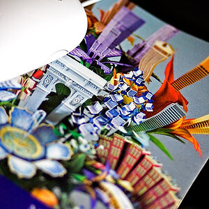
Just testing, tweaking and experimenting with different techniques and styles in post.
 Poof oude wereld by miranfoto, on Flickr
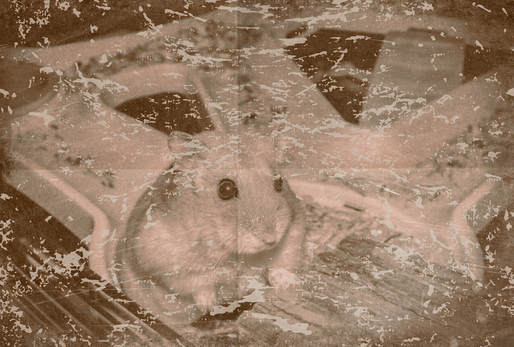 Poof oude wereld by miranfoto, on Flickr
Poof oude wereld by miranfoto, on FlickrPoof oude wereld by miranfoto, on Flickr
Last edited:


![[No title]](/data/xfmg/thumbnail/38/38444-6063bb59cb410c520a1ccccbe58db9c7.jpg?1619738614)
![[No title]](/data/xfmg/thumbnail/32/32154-8c44f76cb4a7777142bd645c3624daac.jpg?1619735234)