Website C&C

indeedies

TPF Noob!
Joined
Nov 17, 2009
Messages
448
Reaction score
4
Location
Tacoma, WA
Can others edit my Photos
Photos OK to edit
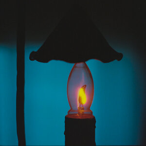
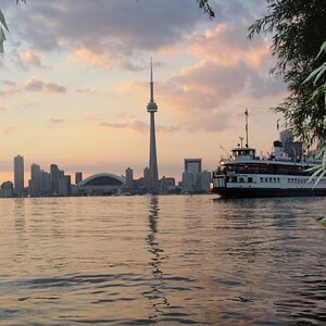
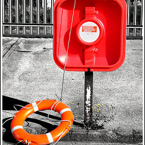
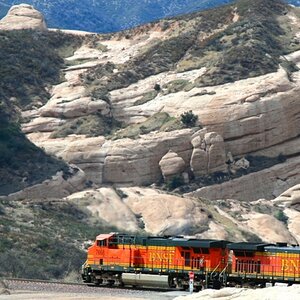
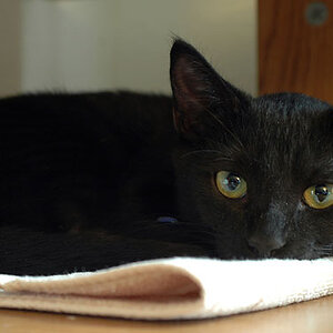
If you have the time I'd greatly appreciate some input from other photographers. Friends and family say it looks great but they almost have too :lol:.

I can assure you I'm not trying to up my SEO (if that's what the abbreviation is) as others have tried to do in the past. I can barely figure out how to make a navigation bar in a Smugmug account :lol:.

Forever Ever Photography- powered by SmugMug

Thanks for any and all comments and critiques!!
 
I think it looks very professional ... my only thoughts is the title "Kids being kids" doesn't fit ... it's much longer than the other titles and kind of blends together so you are not quite sure where the title begins and ends

Otherwise great site :)
 
I think it looks very professional ... my only thoughts is the title "Kids being kids" doesn't fit ... it's much longer than the other titles and kind of blends together so you are not quite sure where the title begins and ends

Otherwise great site :)

I thought that as well but then figured I was being to anal. My goal is to keep away from what everyone else has as their headers. I just can't think of creative things to put. I'm open to all suggestions :D

And thanks for your comment! I had images up from quite a while ago when I really didn't know what ISO really was. Now the images are from a time when I don't really know how to use a flash :lmao:
 
I just saw a giant grey box that said "Flash" so I refused to click it!

Actually I did, overall looks nice. But I have a personal distaste of Flash. I loathe it. :/
 
As a fellow smugmugger I checked out your site. On the Alex and Family gallery, the smug mug header is showing. Same on the soccer gallery. All in all it looks pretty good. I like your contact page. I bet there is a code to enter to erase the "gallery pages 1". Did you just do a large slide show for the home page?
 
Your website is pretty nice. One thing I would change is the font of your website name in the upper left corner. It is kinda boring in my opinion with times new roman font. Maybe make it a little more interesting, but thats my opinion. If you like it like that, then that's fine.
 
It's a good start. I would use a separator between the links. Like mentioned, "Kids being Kids" isn't obviously one link. If you visitors are confused by your navigation, they will leave (the average person will loose interest and leave if they can't find what they're looking for within the first 10 seconds).

I would use bullets or dashes to distinguish the links:

Home • Weddings • Portraits • Kids Being Kids • Just for Fun • Contact

-or-

Home - Weddings - Portraits - Kids Being Kids - Just for Fun - Contact

Notice that at the bottom of your page, SmugMug separates their links with bars (|).

Also, like mentioned, the title font is a bit bland. Try the font "Georgia" and make it italic. It's a web-safe font and looks much fancier. Another option is to make a logo in photoshop or other imaging software and use that instead of text.

-Ray
 
An honest opinion...

I think it is OK. but too many galleries. My personal opinion is that under each heading, weddings - Portraits - Kids Being Kids ect, i want to see the best pictures for each category, not delve through 100's of photos of each genre. Just show your absolute winners.

The Font i don't mind, get rid of the SmugMug on the couple of places and i think it would be a lot better. I do like the random pictures each time you load a page. Oh and maybe if there are locked galleries put them on there own page "client Log in"or similar if I cant see them why put them in front of me?

Zack Arias has some great pod casts where he reviews websites that i have enjoyed perhaps having a watch of a couple of them if you are interested.

Sorry if it sounds a bit harsh. I know personally i like the harsh feedback. And again it is only my rather newbie based opinion.

Ruben
 
Thanks everyone! I like to hear all comments (even the harsh ones). The site is definitely bland but I'm trying to go through the hundreds of tutorials on Smugmug and figure out how to make it my 'own'. I've added seperators to the navigation bar. Had no idea that was even an option lol. I changed the header to Georgia as suggested but I don't have the option to italicize it. And I fixed the Smugmug header issue in those two galleries mentioned.

Superub, you feel I should get rid of the galleries as a whole and just have images within each category (i.e about a dozen or so outstanding pictures from weddings, another dozen under the portraits and so forth)? I'll have to think about this one for a bit. My rationale now is that I want future clients to see that I've done work for quite a few different people. Of course they would notice this in the images if I layed the site out as you suggested as well lol. I also use my site for current clients like a proofing session. I upload their images and password protect the gallery and then they have the freedom to send out the link and password to their families and friends.

Again, thanks to all for your input. It's greatly appreciated and I'm sure this will be a long journey lol
 

Most reactions

Back
Top