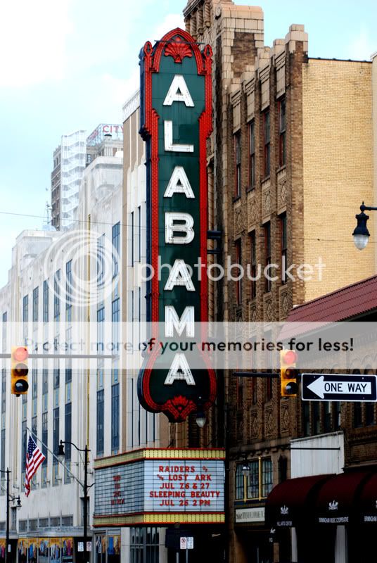
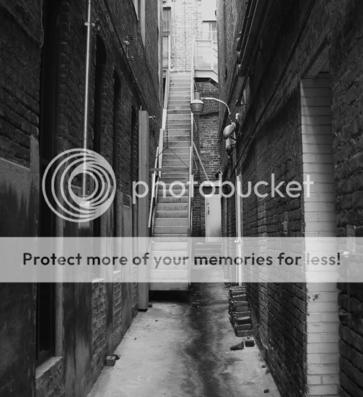
Yeah they're in birmingham. All of them were shot in downtown b'ham. The first one you said you liked is the alley right beside the peanut depot. Its on 21st street and 2ave north I think. Thanks for the comments guys.
We took this one also april but I wasn't sure which one I liked more.
I like them all but especially the first one. The only problem I see is that it seems so long and narrow. I think if you cut it off just an inch or two above the top of the stairs that it would do more for the photo but the is just my opinion. The other long shot I really don't feel that it needs to be cut off, it doesn't seem drawn out because it's busier. Nice work
Yeah they're in birmingham. All of them were shot in downtown b'ham. The first one you said you liked is the alley right beside the peanut depot. Its on 21st street and 2ave north I think. Thanks for the comments guys.
We took this one also april but I wasn't sure which one I liked more.
I actually prefer the first number one over the cropped one. There's more room for your eyes to explore, and the stairs really lead into the picture. Bumping the contrast up so that you got some nice, deep blacks would be my two cents...
I thought the first one had some potential, but could use some brightening, increased contrast and sharpening. It also needed to be rotated like .4-.5 degrees. I played with it a sec and this is what I got.
BTW, your embedded color profile was also corrupted or something. Weird.
I personally might like to have tried taking this a bit more to the left or right to get more of the detail from one of those walls. Just an idea.
I think the peanut depot sign is interesting, but also needs more of this kind of thing... honestly, I'm surprised that one is so soft... hm. Odd.


![[No title]](/data/xfmg/thumbnail/38/38740-d1a7721cf77e9309a9b4a4829c65fdd4.jpg?1619738704)