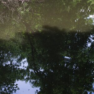
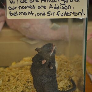
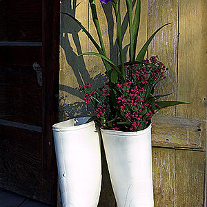
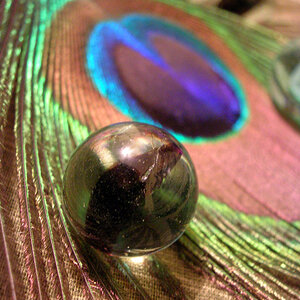
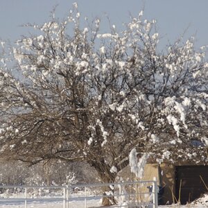
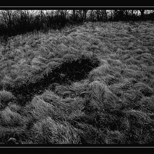
What do you think of these 2? Something I photographed about an Hour or so Ago

DinoThePhotoGuy

TPF Noob!
Joined
Feb 17, 2015
Messages
93
Reaction score
18
Can others edit my Photos
Photos OK to edit
I Have edited them on polaroin. Cause my laptop can't handle Photoshop. Which one is better in your opinion and How could I improve them if they need it? I Have them in Black and White as well right off the iphone. But give me your opinion on these. And I'll post the B/W Versions in a bit. Thanks

KATIAUGA.jpg
AUGOKAIKOUPA.png
 
#1 is nice, #2 maybe not.
 
Yep, 1 is definatley more interesting visually. A little more contrast and I think that would be a winner, I'd like to see some blacks in it which would give it a bit more punch.
 
Very Fox Talbot. I quite like both of them. The subject matter fits the filter very very well.
 
I like them both. I find myself wanting to see the right end of the egg a bit more clearly in the first picture. And a little more separation of the egg and bowl in the second one. A tad more contrast as weepete suggested might do it. Even so, these are quite lovely.
 
I prefer #1 over #2 by a good margin. I agree with the idea that maybe just a touch more detail in the highlights on the egg in #1 would add to the overall look...the look is soft, gentle,romantic, hazy, gauzy--and harsh burned out whites don't really fit in quite right with that type of look. The reason is the transition is very harsh, and it looks posterized to me. I don't like that look.

I've edited with an on-line app called Poladroid, in the past. It randomly cycles through various color toning looks, but always puts that weird, fake Polaroid SX-70-type of border around the images.

If you want a FUN, easy-to-use and low-resource editing application for phone, and computer, check out Pixlr-o-Matic, which has a lot of fun overlays and borders and textures. Some of which are fabulous!

Thanks. I used polaroin.com to make it look like this. Then cutmypic.com. For denoise, contrast, and sharpenning. I kind of prefer photoshop but my laptop can't handle it. So I am using online things that don't require me to have their watermark on my pics. Is poladroid still online so I can give it a try?
 
@Everyone. Thanks a Bunch Guys. Now I am uploading the B/W and see if you Like it Better instead. I just can't figure out which ones are better. Because I Like both of the versions.
AUGO1.5.png
AYGO2.5.png
 

Most reactions

New Topics

Back
Top