You are using an out of date browser. It may not display this or other websites correctly.
You should upgrade or use an alternative browser.
You should upgrade or use an alternative browser.
What is wrong with this picture?
- Thread Starter clipse
- Start date
jake337
Been spending a lot of time on here!
- Joined
- Jun 3, 2010
- Messages
- 4,274
- Reaction score
- 1,245
- Location
- minnesota
- Can others edit my Photos
- Photos OK to edit
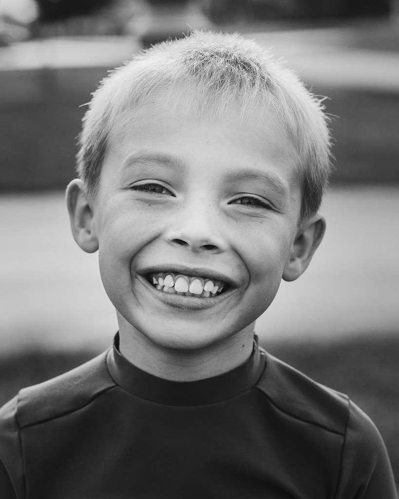
The biggest problem for me was the green color cast on his chin. So b&w it would be for me!
Adjustment brush on the pupils, radial filter and a crop.

Adjustment brush on the pupils, radial filter and a crop.

soufiej
No longer a newbie, moving up!
- Joined
- Jan 3, 2015
- Messages
- 714
- Reaction score
- 113
- Can others edit my Photos
- Photos NOT OK to edit
I'm trying to decide if @soufiej and I are looking at the same image...
Posing Guide 21 Sample Poses to get you Started with Photographing Children - Digital Photography School
Braineack
Been spending a lot of time on here!
- Joined
- Jun 17, 2013
- Messages
- 13,214
- Reaction score
- 5,613
- Location
- NoVA
- Can others edit my Photos
- Photos OK to edit
By that article, he did right: see #1.
your critique on metering is completely off-base.
If I had read your critique and then seen the shot second, I'd expect the world's worse underexposed shot coupled with the most distracting background ever--the shot was metered very well and the background was fine. The pole is hardly that distracting considering how OOF it is.
Yes it's something to be mindful of, and a lot of what you say is useful for that second shot posted, but your critique was just too hypercritical here.
Last edited:
jake337
Been spending a lot of time on here!
- Joined
- Jun 3, 2010
- Messages
- 4,274
- Reaction score
- 1,245
- Location
- minnesota
- Can others edit my Photos
- Photos OK to edit
Hey now don't bring me into your fued, lol!
I lost the top part of the image to bring the subjects eyes higher in the frame and remove the blown out sky.
I lost the top part of the image to bring the subjects eyes higher in the frame and remove the blown out sky.
TCampbell
Been spending a lot of time on here!
- Joined
- Mar 31, 2012
- Messages
- 3,614
- Reaction score
- 1,558
- Location
- Dearborn, MI
- Can others edit my Photos
- Photos OK to edit
Looking at the histogram:

It's high-key, but not over-exposed. The image is bright. The background is bright enough that it seems a bit distracting.
The background is noticeably tilted.
The subject's face is centered (I wish it were higher in the frame).
Always be mindful of the background... your image isn't just your subject, it's "everything" including the foreground, subject, and background (and it all counts).
Ignoring compositional issues and just looking at exposure... if you had reduced the exposure then you might not be dissatisfied with the lighting on your subject's face. But you can reduce the exposure and use fill-flash to bright up the lighting on your subject so that he isn't too dark. I tend to dial in a flash-exposure compensation of -1 stop when using "fill" flash (and tweak from there). That way my subject doesn't look too dark, but it also won't look like flash was the key light.
- Joined
- Jul 8, 2005
- Messages
- 45,747
- Reaction score
- 14,806
- Location
- Victoria, BC
- Can others edit my Photos
- Photos OK to edit
- Moderator 🛠️
- #23
Okay folks, let's keep this relevant and related to the OP.
angelo_lightning
TPF Noob!
- Joined
- Jul 4, 2015
- Messages
- 38
- Reaction score
- 11
- Can others edit my Photos
- Photos OK to edit
with a smile like that, eyes have to have good catch lights. I think the BW is perfect. I think this crop was perfect. So I just dodged out his eyes a bit.
JustJazzie
Been spending a lot of time on here!
- Joined
- Jan 21, 2013
- Messages
- 3,793
- Reaction score
- 1,732
- Location
- Bailey, Colorado
- Can others edit my Photos
- Photos OK to edit
@clipse I do like the editing you did to remove the poll but I prefer the brighter tones in your first image. I like the closer crop, and the eye brightening from @angelo_lightning . B&W and Color both work well in this, I think. Its a great shot!
- Joined
- Jul 16, 2015
- Messages
- 4,212
- Reaction score
- 4,997
- Location
- Oklahoma
- Can others edit my Photos
- Photos OK to edit
Maybe B/W the background and saturate the color on the foreground?

Edit- would need a little work. Now that I've seen it full size, there are some artifacts along the hair line that beg for help.

Edit- would need a little work. Now that I've seen it full size, there are some artifacts along the hair line that beg for help.
Last edited:
- Joined
- Jul 16, 2015
- Messages
- 4,212
- Reaction score
- 4,997
- Location
- Oklahoma
- Can others edit my Photos
- Photos OK to edit
I agree with braineack's disagree with my post!
I just sunk a few minutes into editing it so I felt compelled to post it.
I just sunk a few minutes into editing it so I felt compelled to post it.
philsphoto
TPF Noob!
- Joined
- Feb 15, 2011
- Messages
- 93
- Reaction score
- 5
- Location
- San Antonio, Tx
- Can others edit my Photos
- Photos OK to edit
It is a nice picture, I like the Bokeh. Someone said, "too much head room", I agree. And the post/pole growing out of his head could easily have been adjusted for during your shoot. The background can be just as important as the subject. Try again!
Sent by philsphoto.com from my iPhone using Tapatalk
Sent by philsphoto.com from my iPhone using Tapatalk
Similar threads
- Replies
- 0
- Views
- 89
- Replies
- 25
- Views
- 748
- Replies
- 22
- Views
- 1K
- Replies
- 0
- Views
- 106


