What would make this more interesting?

Kanthaka

TPF Noob!
Joined
Aug 20, 2014
Messages
105
Reaction score
8
IMG 0760 darker.jpg - Google Drive

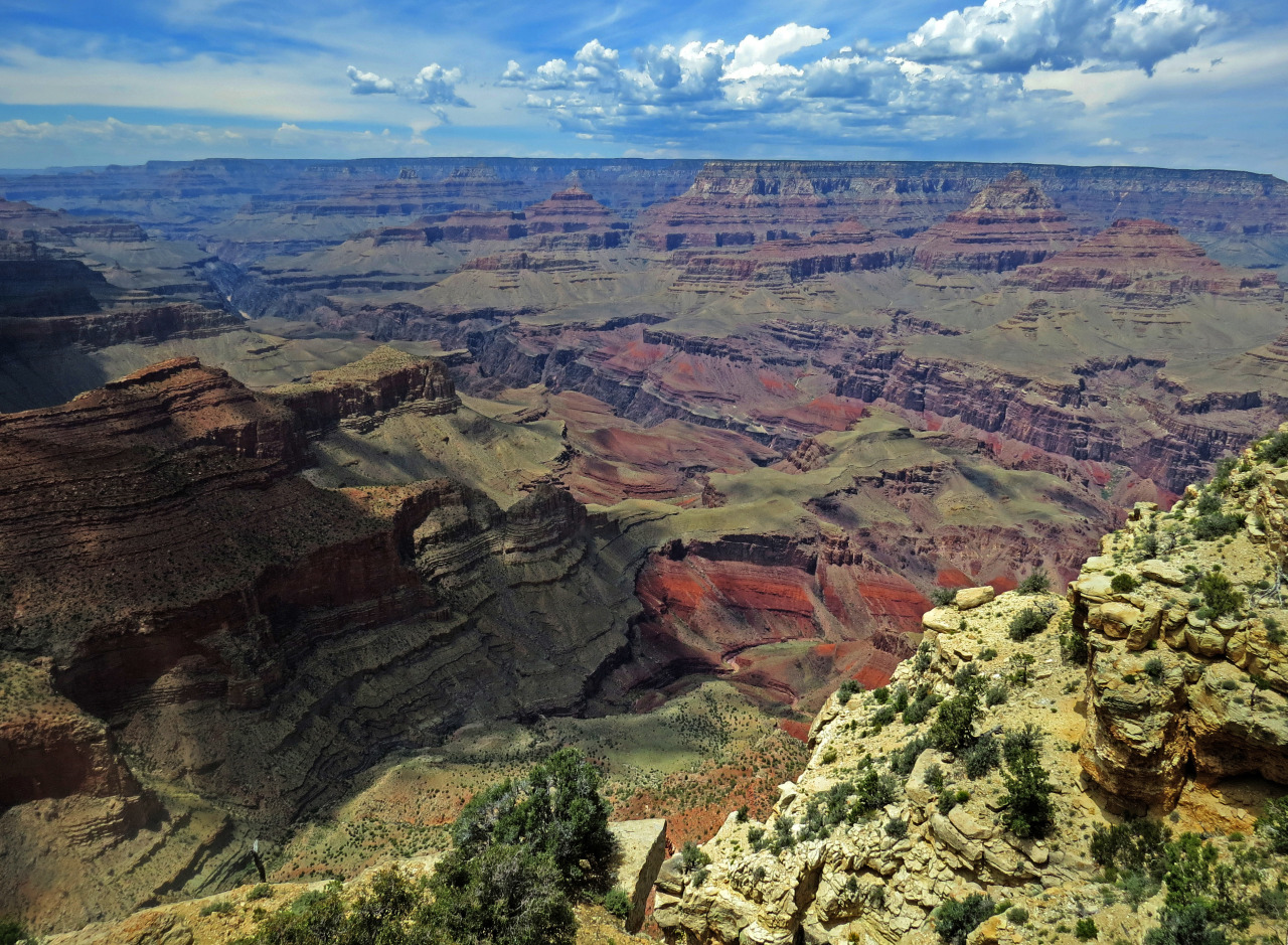
This is one of the pictures I took while I was on vacation in Arizona. When I first took it, I really liked the image but as I kept looking at it, it just felt like there was something missing. Like there would have been something to make this better... somehow. Also I can't decide whether the two differing rock colors (foreground & background) actually work together or if it just makes the image look weird. What do you guys think?
 
I'm not sure about "more interesting", but what I would do, were it my image is level it, life some of the foreground shadows a bit, reduce the foreground highlights, and use a combination of dodge & burn tools to enhance the image, and do some careful saturation & clarity adjustments.
 
I agree with tirediron, it needs a little work in post. My take on why it fels slightly off is that my eye is drawn first to the lightest part of the scene (the foreground rocks) and then in a kinda reverse V shape to the dark shadows on the left, but then my eye continues out of the frame. Unfortunatley there are some things that just look better in real life.
 
Yeah, I kinda wished I could have taken this from a better vantage point. Unfortunately, there wasn't a platform on the other side that I could stand on. :ambivalence:

I do agree that the shadows on the left side of the image is a bit too dark though. The rest of the stuff that tirediron said went completely over my head though. *sigh* Guess I've got some "Googling" to do...
 
What do you guys think?
Please post it here if you want more people to view it.

The issue is not whether the two colors of rock "work together", but there are other issues which are more troublesome.

It seems underexposed, it's not level, the cloud shadow detracts significantly, and there is basically no well-defined subject.
Ok, so the rock colors are fine as is? I made the picture darker because it made the sky bluer & it also brought out the colors of the rock better. Guess I did that a little too much. I'll see if I can brighten it up. But, like I said earlier, I don't really know how to do that other stuff in post. I'll look it up but if you can give other tips & tricks, that would be much appreciated.

Now the most confusing part about your reply is the part about there not being a well defined subject. I think that's what I thought was missing. How do I make the canyon a stronger subject? I mean it takes up most of the frame but when I look at it, it just doesn't feel like it. How do I fix that?

Thanks!

Sent from my A0001 using Tapatalk
 
How do I make the canyon a stronger subject?
That's the $64,000 question, isn't it?

People who make and sell pictures of the Grand Canyon have made some OUTSTANDING photographs, otherwise tourists would not be willing to fork over thousands of dollars for one.

Sometimes the canyon is just a canyon, and sometimes there is something that produces THE SHOT. When you find that, take THE SHOT and you'll have something outstanding.

Yes, I know my post didn't tell you much, but as a helpful friendly tip, study the photographs that are selling for thousands and I mean REALLY STUDY them, and learn to see what makes them remarkable.

Haha, yeah. I guess you're right. One visit to this place isn't gonna be enough to get me THAT shot. Bummer. Good thing I like to travel then. :glee:

Is this any better?

tumblr_nsirzqPw971u4l4bpo1_1280.jpg


Obviously, I didn't do everything that you guys suggested but I just wanted to know whether it was headed in the right direction or not. And, also, I want to know if it's worth it to keep editing this picture or if I should just dump it and move on. :frown-new:
 
Yes, it's better, but I think the colors might still be off a bit.

Sometimes one of the folks here will offer to try an edit of their own, providing the OP allows editing.
 
Yes, it's better, but I think the colors might still be off a bit.

Sometimes one of the folks here will offer to try an edit of their own, providing the OP allows editing.
I'd be ok with others editing it. I think that might help me out a bit actually. BTW when you say that the colors are still a bit off, are you still referring to the exposure?

Sent from my A0001 using Tapatalk
 
Google Drive has changed the file type from .jpeg to .webp, a file type Photoshop cannot open.
 
Google Drive has changed the file type from .jpeg to .webp, a file type Photoshop cannot open.
The second pic was uploaded on Tumblr so it should still be .jpg

Sent from my A0001 using Tapatalk
 

Most reactions

New Topics

Back
Top